Showing posts with label web forms. Show all posts

Tuesday, 4 July 2023

Hand picked Survey tools for UX designers


Best Survey tool for UX design


Surveys are an important user research method, in which user information at bigger counts gets considered. Surveys can be used for quantitative data gathering method which can be conducted to understand user information, usage pattern, and preferences etc. for any new or launched application. Also in marketing industry surveys are an important tool for understanding market status. There are some tools available which makes this complete process easy & flexible. They include survey creating, conducting survey on internet, sharing survey to users on internet, real time analysis of survey 
Responses and report generation of survey response etc. Providing a curated list for some top survey tools.

Share:
Continue Reading →

Sunday, 1 November 2020

Designing Usable security systems


Security systems are irritating

Every time when I enter in abc website it asks me for Login, I am getting irritated with Typing my username and Password. Every 30 days it asks me to change my password and I can’t repeat my old passwords, if accidentally I enter my password wrong x times it locks my account and unlocking account is again big task because it asks 3 security answers which I set 3 years before. Why it is so complex and bad? Answer is – “This if for your security”. Which is very good in securing your data and information but very bad in user experience. Current security systems are very irritating but this is not a fault, this is an opportunity for innovative designers to design security systems in such a way so that user’s data should be secured and using security system in easy and fun, designing USABLE SECURITY SYSTEM.

Ex. Income tax return website – Normal people uses this website once or twice in a year for filling their income tax returns and filling ITR process starts with Login and nobody remembers their password so process starts with Forgot Password. Complete process is starting with unnecessary step (Forgot Password) and leads to irritation.

UX EBOOK FREE


Real life frustrations 

There are some security elements running in thousands of websites which may be very secure but increasing cognitive load/ increasing frustrations in the aspect of Usability.

Passwords
On an average a normal internet user has 60 to 100 websites where he/she has login (Username and Password) so at one time a normal internet user remembers 100+ passwords. Some of the websites requires more security for at regular interval he/she has to change his/her password and he/she can’t use their old passwords. Remembering Passwords is real pain now a days. Pan increases when any website asks for setting more secure passwords (Password should be alpha Numeric, containing Special characters and Capital letters bla bla bla…)

Security Questions
Setting security questions for any site is also one big pain, some security systems also asks you to set questions also along with answers. Increasing cognitive load for a user.

Captcha
Have you smiled when you have seen captcha ever? Never… Specially captcha on mobile apps/websites.. oh god save me… Just to verify I am not a machine or robot it takes 1-2 attempts me to complete my work. Captcha has some more usability issues like for visually impaired people reading and understanding captcha is a real pain.

M-Pins
Although M-Pins are easier as compared to secure password but sometimes it becomes very easy in cracking. Most of the people set their M-Pins with their DOB or some patterns like 1111, 0000, 1234 etc. which are easily in cracking.

OTP
This is a new one (One Time Password) this reminds you the importance of your mobile phone. It has several issue like sometimes Network in your mobile phone varies and you can’t get OTP in your phone on time and your session gets expired. Secondly If you not having your phone with you or if your battery has died you can’t process your work.

Session
This is also a trouble you are filing a form and you have completed it mostly suddenly a message comes “try again your session is expired”. Your whole work got wasted without saving.


How to design usable security system

Understand user behavior, find patterns
Before designing any security system for any website or office understand user behavior through research. User research is very important for designing a usable security system. Security system will be usable when it helps user in performing user their intended tasks.

Use Cognitive Principles
For remembering passwords use cognitive principles example chunking. Chunked information easily gets stored and retrieved by human brain.

Think about frequency of use
Keep frequency of use in mind before designing security system, Example Income Tax return website, a normal user visits once or in every six months. SO if you designing security system for this site don’t expire password in less duration.

‘Show password’ element in place of ‘Repeat password’
To verify password instead of using ‘Repeat Password’ provide ‘Show Password’ in forms.

Show Password rules & tips upfront
It becomes very useful when tips & rules for setting password are available upfront for a user.
Alternate option of authentication from OTP: Don’t depend on OTP on mobile only, send OTP on email ID also.

Find forgot password/username data and analyze it
Get statistics about ‘How many users has used Forgot Password in last some time (say 1 year)?’ and analyze this data. It can give you more insights about security system

Be innovative

“Think about usable login system”
Usage of technology and innovative thinking is required in finding amazing & secure login methods. Example: Finger print scanner technique in iPhone.

Designing secure and Usable security system is becoming new opportunity for designers and must business need.


About Author

Abhishek Jain (User Experience Designer)

Share:
Continue Reading →

Saturday, 4 June 2016

Wireframing Basics - Part 1

This is the first article of Wireframing basics series, in this article series we are going to learn about basics of wireframing, design principles, importance of wireframes etc. So lets start with understanding 'Wireframes'.

Wireframes

A wireframe is a two-dimensional illustration of a page’s interface that represent information hierarchy, functionality & content of a page.

Wireframes presents solutions (ideas & concepts) in better way than concept note.

Wireframes include

Important elements & their positions (header, footer, navigation, content etc.)
  • Grouping of information (menu links, content)
  • Labeling of content (navigation links label, content label)
  • Place holders, content text (images, description)


5 Planes of UX

There are five planes of user experience design as per James Garrett, Strategy, Scope, Structure, Skeleton and Surface. Wireframing work comes under 4th plane, “Skeleton”


Types of wireframes

Wireframes  can be divided in to 2 categories based on detailing, presentation, behavior and estimates.

Low Fidelity Wireframes

  • Basic paper sketches, digital basic structure
  • Containing information placeholders and navigation

Tools: Paper sketches, Balasmiq, MS Office


High Fidelity Wireframes

  •  Detailed screen design with clickable functionality and interaction.
  • Information presentation in details.

Tools: Axure, MS office, Just in mind etc.


About Author:

Abhishek Jain


Share:
Continue Reading →

Wednesday, 11 May 2016

Wireframing Basics - Part 3

In Wireframing Basics - Part 1 we have seen, wireframes, types of wireframes, 5 Planes of UX etc.

In Wireframing Basics - Part 2 we have seen, some important points like F shape pattern, 'Call to Action', Affordance etc. in detail.

In this last article of 'Wireframing Basics series' we will look at more information about wireframes. 

Importance of Wireframing

  1. Demonstrate concepts & ideas effectively
  2. Easy in creation, quick in time
  3. Supports Early Usability Testing
  4. Easy Iterations and changes

Wireframes focus on

  1. Identification & Arrangement of Content , UI elements
  2. Identification of  Information and Actions to be performed in the application
  3. Placement and prioritization of information in a way that facilitates understanding
  4. Screen / Page Navigation : How will the user navigate using the application screens
  5. Information Architecture : What will be the flow of information OR information Hierarchy  of the data present? Which data presented on the screen should get prime importance?
  6. Depicting all Use cases and Scenarios

Wireframes DO NOT address

  1. Do not use colors. If you would typically use color to distinguish items, instead rely on various gray  tones to communicate the differences.
  2. Do not use images. Images distract from the task at hand.  To indicate where you intend to place  an image and its size, you can instead use a rectangular box sized to dimension with an “x” through it.
  3. Use only one generic font. Typography should not be a part of the wireframing discussion.  Within the wireframes, however, you may still resize the font to indicate various headers and changes in the hierarchy of the text information on the page.

<< Previous article 'Wireframing Part 2'

About Author
Abhishek Jain

Share:
Continue Reading →

Tuesday, 10 May 2016

Wireframing Basics - Part 2

In Wireframing Basics - Part 1 we have seen, wireframes, types of wireframes, 5 Planes of UX etc.In this article we will look at some important Principles before starting wireframing work.

1. F-Shape pattern

How people read on Web; they don’t. – Jacob Nielsen
  • People SCAN web pages
  • The F-Pattern describes the most common user eye-scanning patterns when it comes to blocks of content.


Note points:
  • Make webpage text easy for users to scan.
  • Use bold headings and subheadings.
  • Use bullet lists when you can to break up content. Bullets are also easy to scan.
  • Priorities & place the content in hierarchy

2. Call to Action

‘Call to action’ are buttons or actions for most important or primary tasks on website.

‘Call to action’ helps in understanding that
  • End user is able to understand what next he/she can do
  • Where each click will lead them


Make Call to Action effective by:
  • Choosing end user familiar words 
  • rather than business jargons
  • Placement
  • Color
  • Size
  • Minimizing counts

Examples:


3. Affordance

  • According to Norman (1988) an affordance is the design aspect of an object which suggest how the object should be used; a visual clue to its function and use. 
  • Good designs are intuitive and good affordance helps in making design intuitive.


Example:

Affordance in Physical world

Affordance in digital, ex.  Buttons, Text fields


<< Wireframing Basics - Part 1                          Wireframing Basics - Part 3 >>


About Author:

Abhishek Jain

Share:
Continue Reading →

Tuesday, 26 January 2016

Landing Page Design: Building the Ultimate Landing Page

When I started to implement the Ultimate Hacking Keyboard, I wasn’t very marketing savvy. As an engineer, all I could see ahead was product development and technical challenges. However, marketing is just as important and must not be overlooked. A good landing page is a must-have.
Luckily for us, we realized that there’s a lot to do before we start our crowdfunding campaign, and an attractive site could turn this otherwise idle time to our advantage by capturing people’s attention, generating more subscribers and priming us for the campaign.
So, the development of the Ultimate Landing Page for our Ultimate keyboard began in earnest. 

How This Landing Page Guide Differs From The Rest

When Google-searching for “landing page,” you’ll find dozens of excellent articles that raise a number of important points, like “above the fold” content should load in a snap, be relevant and contain a form to gather leads.
The Arduino-based Ultimate Hacking Keyboard tries to be different, and so does its landing page.
While most of these landing page design rules are important, I want to touch on a number of other aspects of our landing page. A lot of work went into choosing and integrating various third-party services and technologies that work behind the scenes, so I’ll talk about these.
The focus of this landing page guide will be technical. My goal is to help other developers narrow down their search for the right third-party services and technologies, which they will deploy in their landing page designs. This will, hopefully, help them save time and money, which could otherwise be wasted on fruitless experimentation. 

Landing Page Video Production And Hosting

Presenting video on the web is easier than ever, and yet, few sites use it. It’s not a technical challenge from a web perspective, but it is an investment of other resources, namely time and money. We created about 12 iterations of our landing page trailer video, gradually refining every little detail. The design process was exhausting but very rewarding. I consider this trailer video to be the crown jewel of our landing page which differentiates us from the pack.
Please bear in mind that high-quality content creation is expensive. If you want the best possible results, you will need to outsource the work to professionals, and obviously, start by making sure you can afford it. Depending on what you need, and what sort of budget you have, you could get away with an in-house video. It depends on your skill set and the type of landing page your plan to design.
We settled on a dynamic 3D animation, demonstrating the basic functionality of our keyboard on our landing page. However, if you need a 2D animation of an app or web service, or if you need camera footage, the process will be somewhat different and maybe less challenging than ours.
Once you have a video made, you have to host it somewhere, which leads us to some options.
YouTube needs no introduction, as it is the undisputed market leader and a synonym for video on the web. It’s a reasonable choice that would have worked well for us, but we didn’t find its embedded player to be aesthetically pleasing.
Vimeo was an obvious second choice. It features a super clean, elegant, minimalistic design. It’s known for hosting quality content and for its superior high-definition. It was love at first sight, so we ended up choosing it for our landing page.
Wistia is another popular choice among marketers. It provides advanced features like video heatmaps that show you which parts of your videos have been watched, skipped and rewatched. It would have been a great choice, but it doesn’t support full HD quality, a deal-breaker for us.
This is our landing page trailer video on Vimeo:

Vimeo is the way to go for landing page video.
It’s worth delving into the APIs of these services to better capture the attention of visitors. For example, using the Vimeo player JavaScript API we made the “I want one” buttons on our site pulse three times in a row right after our trailer ends. Used properly, little tweaks like this can increase the conversion rate.
To make matters even more complex, embedding videos on responsive sites is no easy matter. The video has to scale properly, and the experience must be fluid. It can be done by utilizing some not-so-obvious CSS tricks. 

Hosting 3D Content

In order to give our landing page visitors a more immersive experience, we wanted them to be able to explore our keyboard in 3D. There are a few WebGL-based services created specifically for this purpose.
Sketchfab is the most popular of these services. It’s easy to master, provides a lot of visual settings, and is embeddable into a wide range of popular sites, which is why we chose it. However, depending on your needs, you may want to check out a couple of alternatives.
Verold Studio boasts some advanced features, such as animation and interactivity. I’m sure it’s the right choice for many, but we couldn’t import our CAD model into it.
The most minimalistic and simplistic of all WebGL services is p3d.in, but it didn’t support the high-resolution textures used in our 3D model, which was a deal-breaker. Also, it seems that it’s not possible to rotate the model until the textures are fully loaded, which doesn’t result in a great user experience.
This is how our keyboard looks in Sketchfab:

Check out why our landing page relies on Sketchfab for 3D content.

Creating 2D Animation

One of the major advantages of our keyboard is that it dramatically reduces hand movement. We wanted to visualize this on our landing page by putting the UHK and a regular keyboard side-by-side and displaying an animation. Implementing this wasn’t as simple as it sounds.
Using an embedded video did not only feel like overkill, but it would have to be rendered first, which is extra work. Animated GIFs weren’t a viable solution either given their huge size and limited palette. Canvas would work, but I found SVG to be even better suited for this purpose because the hand objects can be separately moved without affecting the rest of the graphics.

2D animation is an important component of landing page design, but it's not as easy as it sounds.
Creating this landing page animation was certainly more time consuming than we expected, but the end result looks nice.
Sometimes you have to make your way through cross-browser issues, JavaScript library bugs and nearly endless technical challenges just to make a seemingly obvious thing work. Never underestimate the number of things that can go wrong!

Real-Time Analytics

Everybody uses Google Analytics and we are no exception, but it’s not specifically built for real-time operations; there are better candidates for this purpose.
Chartbeat is great at notifying us when the site exceeds certain thresholds, most notably the number of simultaneous users on our site. Every now and then someone links our site in a forum, which generates a sudden traffic spike. Thanks to Chartbeat, we immediately know about such events, and able to join the ongoing conversation early on.
Mixpanel helps us gather and analyse events. Site visits, opening the subscription dialog, subscription and confirming the subscription, are all events that we log. Mixpanel can build funnels out of these events and visualize conversion rates, making things measurable so that we can act upon the numbers.
Clicky is great at a number of things and we especially love its site heatmaps feature, which reveals where users click on our site. Based on the results, we can adjust the layout of the site, change its content or redesign it to achieve the desired outcome.
HotJar enables website owners to record the interactions of their users. It saves every mouse and keyboard action, and constructs videos out of them so that one can watch what visitors do on the site. Yes, it’s the most privacy intrusive of all, so much so that it’s almost scary!
I surely couldn’t do justice to these services by singling out one because all of them offer so much. Most such services can visualize real-time visitor activity on a map, on a summary screen, or a in visitor list, along with lots of metadata such as the referrer URL, operating system and screen size.
I believe that these are some of the best real-time analytics services out there, but there are others, so if you have some specific requirements, Google search for alternatives.

Error Logging

Websites are getting more and more JavaScript-heavy, so much so that critical features of your site may depend on it. In our case, the subscription dialog is triggered by JavaScript code.
When implementing the subscription feature, I tested it on major browsers and sat back with confidence, believing that I’ve done my part. Later on, I got an email from a visitor complaining that the landing page subscription feature doesn’t work.
As it turned out, the visitor in question used Adblock Plus in its strictest mode, which blocked the Clicky analytics script. Unlike other analytics services, Clicky’s embed code wasn’t resilient in this respect, so upon logging the subscription action and referencing the Clicky object, the code generated an error.
After this incident, I started to think hard about how to avoid such situations in the future. It occurred me that I should use the global window.onerror event handler to catch such errors and log them. Then, I searched for suitable logging services, found many, and ended up choosing Errorception.
I love Errorception because it does one job and does it very well; its user interface is minimalistic and functional, the support is great and it simply provides a lot of bang for your buck. One can look into the individual errors to investigate stack traces along with other information.
Since integrating Errorception, I’ve resolved about a dozen bugs some of which were very unlikely and unexpected. For example, once I got a localStorage related error, as it turned out, when Safari is in private browsing mode localStorage.setItem() results in an error.
I think it’s impossible to account for every such outlier case, and only logging can reveal them.
The Build Process
The index page started out as a single HTML page, hosted in WordPress, containing all the CSS, HTML and JavaScript code. In the beginning this was a feasible solution, but as it grew, it started to become a maintenance burden and a more modular approach was needed.
I ended up splitting the CSS, HTML and JavaScript code, resulting in a number of files. Then I converted the CSS files to LESS files to further increase maintainability. Finally, I needed a build process to assemble all these tiny files.

Check out our landing page build process, step by step.
Now the landing page build and deploy process looks like this:
●     gulp-less takes the LESS files and outputs a single CSS file.
●     gulp-browserify merges the JavaScript files as a single JavaScript file.
●     gulp-file-include merges the HTML files as one HTML file.
●     gulp-concat links the above into a master template.
●     gulp-ssh uploads the master template to the server.
●     gulp-ssh calls a node.js script on the server which generates multiple landing pages per ad campaign based on the master template and a spreadsheet.
●     gulp-ssh calls wp-cli on the server to update the landing pages.
The above is a slightly simplified description because this process is not purely sequential. Various gulp tasks depend on each other and watchers are set up so upon modifying a file only the dependent files get rebuilt.

Optimizing For Performance

Performance matters a whole lot, especially if your landing page gets Slashdotted and you get 260 visitors simultaneously, like we did as can be seen above. Luckily, our $20 per month Linode VPS performed like a champ without breaking a sweat, although it wasn’t exactly luck to begin with, so let me share some tips.
Use nginx instead of Apache. Apache is a memory hog and I was getting daily disk IO threshold notifications from Linode because Apache was trashing. I’ve never yet had another such notification since using nginx + PHP-FPM.
WP Super Cache is the easiest, and probably most profound way, to make your WordPress site go faster. Instead of generating pages from MySQL on-the-fly, it saves them as static files and serves the content of those files.
Image lazy loading is your friend, especially if your page, like ours, contains a lot of images. We’re using the WordPress Unveil Lazy Load plugin.
You can lazy load not only images but any assets. If a section of your page depends on an additional script you can lazy load it when it gets within the viewport. You can check viewport visibility with the jQuery inview plugin and load the script with jQuery.getScript() or with any other script loader.

Final Words

I touched on a lot of landing page design issues in this post, possibly too many for such a brief overview, so let me sum up the most important points:
●     Don’t only use text content, but include rich media like video, 3D and 2D animation. It will make you stand out and encourage visitors to share your ideas.
●     Use real-time analytics so that you can swiftly react to sudden traffic spikes and join the ongoing conversation.
●     Always log errors because there are a lot of things that can (and will) go wrong.
●     Split your codebase into small pieces for easy maintainability and set up a build process to assemble the tiny pieces and deploy the bundle.
●     Optimize performance so that your site will keep up even when encountering with the highest traffic.
This article is intended to be a glimpse into landing page design and deployment from a number of aspects, and as such, it’s not supposed cover everything in detail. In any case, I hope it gives you a couple of ideas and you find it useful and time-saving.
I always strive to learn more and improve things further so you’re welcome to visit our landing page at UltimateHackingKeyboard.com and give me additional feedback in the comments below on how to improve our site.
All suggestions, constructive criticism and ideas will be appreciated.
This article was originally published on Toptal

About Author

László Monda
László is a full stack developer experienced in a wide range of languages and frameworks. He boasts a system-wide understanding and comfortably moves across the various layers of the stack.
Email: jordan.lyons@toptal.com
xxxxx
Share:
Continue Reading →

Tuesday, 3 November 2015

15 tips to Improve Usability of Web forms Part 1

Almost every website contains at least 1 form. It can be a simple login form to a very complex Income tax return form. A form on a web page usually comprises a set of input fields for the user to fill in and submit to the website. In simple language a user or human interacts with form and submits some information. Forms play an important role in user experience and also decides conversion or success of your website. We all have faced frustrations while using some forms in our life and that bad experience affects the brand identity of website owner/company. So it is very necessary to design better, easy, helpful and user friendly forms. Presenting some suggestions for making forms more Usable below.

Tips for Improving Usability of FORMS

#1. Group the form fields logically

Categorize the form fields in logical groups, this reduces cognitive load and user understand forms easily.

#2. Make labels visible

It is a good practice to make 'Labels/titles' always visible for user. It improves association and this information is really important for a user.


#3. Action buttons should be labeled in verbs

Every form has some intention or motive. That motive or goal of a form can be called 'Verb' of a form. Ex. a form for booking movie ticket online will have 'Verb' as 'Book ticket'. Always label primary action buttons as 'Verb' of that form. This reduces cognitive process and makes decision making more stronger. Specially in confirmation messages (pop-ups) use 'verb' in action buttons.

#4. Provide suggested text to help user

If possible, show the suggestions or contextual help to user. It can increase efficiency of form submission and also reduces the chances of errors.


#5. Show info and tips along with fields

For complex and difficult form fields show the Tip/information along with fields. It helps user in understanding about fields and makes form more user friendly.

#6. Using wizards for simplifying forms

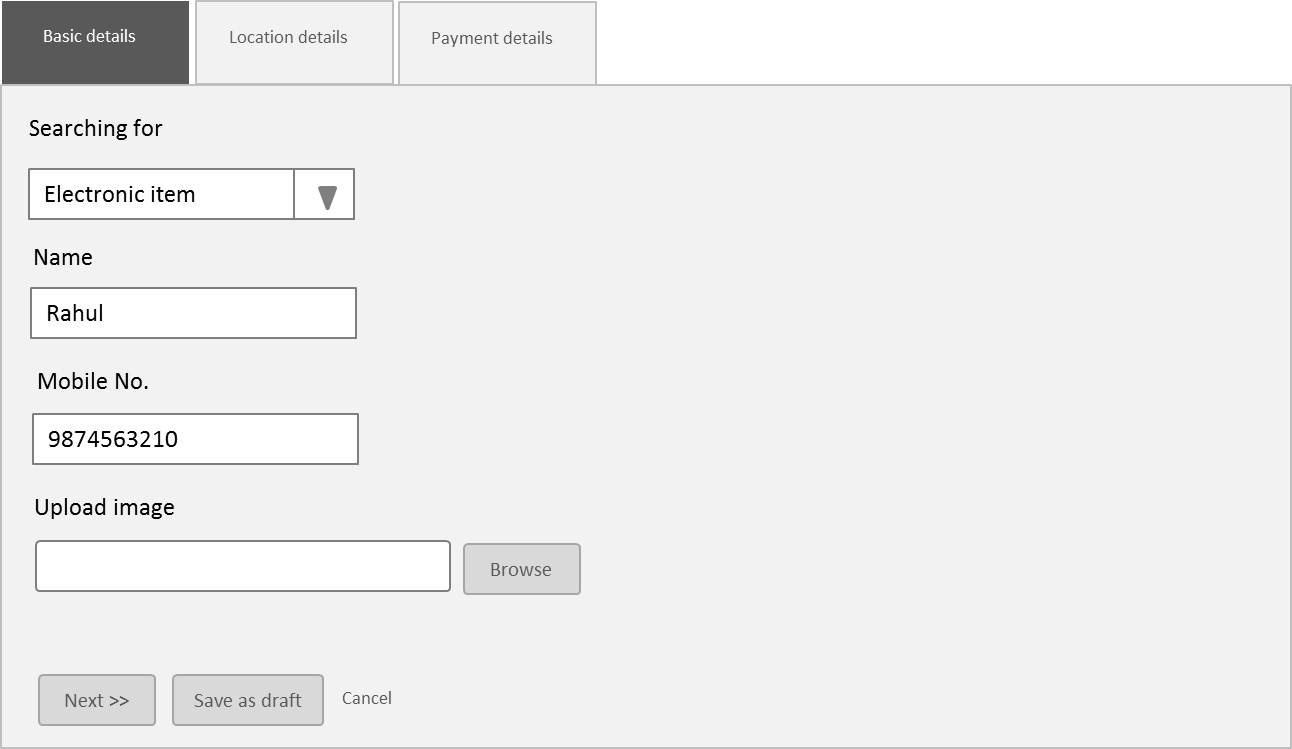
Break the complex and lengthy form in simple and short steps for the ease of user. Use step wizards for simplifying complex form. This makes user's life easier and less load on him/her while filling form.

#7. Increase the affordance of primary actions

Separate the primary actions with secondary action buttons by increasing affordance of primary actions. It reduces the probability of accidentally hitting wrong button and getting data lost.

#8. Don't ask for unnecessary info.

Don't increase form by asking some unnecessary information from user. Optimization of form fields is the first step in improving form usability.

Tip #9 to #15 -  15 tips to Improve Usability of Web forms Part 2

Author: Abhishek Jain (@uxdabhi)
Share:
Continue Reading →

Wednesday, 30 September 2015

15 tips to Improve Usability of Website forms Part 2

In the previous article we have seen how Web Forms are important and some tips to improve usability of forms. (Tips #1 to #8 read article part 1 )

Suggestions for Improving Usability of FORMS continued..

#9. Use proper form elements

Proper usage of form elements is really necessary. Minimize the typing and make more use of selection. It will reduces human effort and will lead form to more efficient.

#10. Show the progress indicator for lengthy forms

Visibility of system status is one of the Heuristic Principle, with the use of this principle we can engage user in filling lengthy form. Show progress indicator for lengthy forms, let user know about current status and remaining status of form.


#11. 'Save as draft' or auto save

Apply heuristic principle of 'Error prevention' and provide auto save option when form is lengthy. You should provide flexibility of filling form in chunks by providing 'Save as draft feature'. If accidentally something wrong happens make sure the information a user has filled is saved.


#12. Errors should be shown along with help

Don't show the error only show how a user can remove it (solution or help).

#13. Always show the success message in forms once completed successfully

It is a good practice to show 'Confirmation message' after completion of forms. This improves the visibility of system status.

#14. Form flow using Tab key

Consistent Form flow is very important especially when probability of using forms through keyboard high. When a user uses forms using Tab key it should flow in proper manner.

#15. Don't use technical or business jargon

Form fields should be written in plain and simple language which a normal user can understand. Especially in error messages don't show technical jargon.

Previous article: 15 tips to Improve Usability of Website forms Part 1

Author: Abhishek Jain (@uxdabhi)
Share:
Continue Reading →