These
guidelines will help in designing better mobile apps which will improve the
overall user experience. Mobile is very powerful device and becoming as an
important part of human life. So it is very important to design better, simple
and interesting interfaces which helps people in their life and also bring satisfaction. some basic design principles are mentioned in the context of Mobile
application.
1. Avoid
designing long Menus in Mobile app
Long Mobile menus are the result of poor architecture and content grouping of application. It affects the ‘Decision Making’ of a User, also it destroys the importance of main function. Group the functions properly and show the small menus with less no. of choices.
2. Select
the right navigation system for your application
Navigation is the important aspect of any mobile app
because User follows the navigation pattern and finds the information. There
are 2 types of navigation system given as follows,
Primary Navigation types
- Hierarchical (Drill
Down)
- Persistent
- Sequential
Secondary
navigation types
- Search
- Index Pages
- Quick Links
- Bread Crumbs
- Embedded Links
3. Web to
Mobile transformation should be responsive
Mobile websites should be responsive to provide an
optimal viewing experience—easy reading and navigation with a minimum of
resizing, panning, and scrolling—across a wide range of devices.
If you are a design enthusiast,
then this post will be helpful in knowing some top design colleges & schools institutes
in India for your bachelor & master’s degree in design.
(top design colleges in India best design colleges in India)
Disclaimer: This article does not offer any ranking or position of colleges/institutes, it is requested not to make college selection decision using this article ONLY.
Offers a 2.5 years M.Des course in Product Design, Furniture Design, Graphic Design, Animation Film Design, Film & Video Communication Design, Exhibition Design, Textile Design, Toy & Game Design, Photography Design, Apparel Design, Transportation Design, Lifestyle Accessory Design, New Media Design, Information Design, Interaction Design, Retail Experience Design, Universal Design, Digital Game Design from its three campuses at Ahmedabad (Main campus), Bangalore (R&D campus) and Gandhinagar (PG campus), India.
Awards a Master of Design degree in Industrial Design, Visual Communication, Animation, Interaction Design, and Mobility and Vehicle Design. All programs require two years of study.
Disclaimer: This article does not offer any ranking or position of colleges/institutes, it is requested not to make college selection decision using this article ONLY.
What do your
friend's startup, your small local business and a large company such as Google
have in common? No, this isn't a trick question.
The answer is actually fairly simple and intuitive. All of the aforementioned
businesses depend on users enjoying their products and services in order to
continue doing business successfully.
In the recent years many have noticed the importance of UX design and are
investing more and more into its research and development.
Be it
physical or digital, a product is bound to rouse both an emotional and
intellectual response in its consumer based not only on the way it works but
also how it looks and feels. Whether that experience is going to be a
good one or a bad one is going to make an effect on your sales, and this is
exactly where a good UX design team proves itself to be absolutely crucial.
Why “X” marks the spot
UX design is about two things only – the User and the Experience. Give
your users a positive experience and they will reward you with their trust and
their business. Companies with highly effective UX have increased their revenue by 37%, and top 10 UX leaders in America
outperform the S&P with close to triple the returns - a significant lead.
When
experiencing your product leaves the user with a foul taste in their mouth,
they will quickly take their business elsewhere. 90%
of users reported they stopped using an app due to poor performance,
and 86% deleted or uninstalled an app as a result of encountering problems with
it's functionality or design. Studies
show that 86% of users think that an exceptional customer experience is worth
paying extra. With these figures in mind, it is not difficult to understand why
user experience focused companies like Apple, Google, Adobe, Dropbox and Amazon
are year after year leaders of their respectable fields.
While having a great product is paramount, in today's market it often is not
enough to keep you ahead of the curve.
This is why investing into UX design has proved to be a game-changing
strategy. A pleasing UX has been proven
to earn the users' interest, business, and most of all – their loyalty. 48% of
users say that arriving on a business site that isn't working well on mobile
will be seen as an indication of the business simply not caring, and 52% said that a bad mobile
experience made them less likely to engage with a company in the
future.
The principle extends beyond just mobile devices; 40% of users will abandon a
web page if it takes more than three seconds to load, while 79% will search for another site to complete their task.
Designing
experiences
But what about design? How important is actual aesthetic property of your
website (or a product) when it comes to user experience?
An experiment conducted by M. Tractinsky tested
relationships between users' perceptions of a computerized system's beauty and
its usability.
Its outcome showed that, undeniably, the role the aesthetics plays in HCI
design is a major one, and should be kept in mind at all times when catering to
the users' needs.
It seems safe to conclude that the business value of UX design is so colossal,
one can simply not afford to ignore the importance of a highly skilled team of
UX designers putting their expertise into crafting the experience your users
are going to undergo and enjoy while engaged with your service or product. Engaging
and connecting with the users is what every company should strive
toward, and what good UX design helps you achieve. With design focused on UX, a
company is forced to createfor their
customer. A relationship is formed and it grows, bonding the customer with the
product.
Ines
Anić(@i_anic)
is a Content and Administrative Associate at UX Passion, where she writes about
UX, UI, design and social media management. She is passionate about UX,
Usability, web design and video games; and curious about technology, gadgets,
IT and the world of startups. Ines is looking forward to connecting with you on
LinkedIn and Twitter!
As most UX designers may tell you, there is no prescribed path to
becoming a UX designer. Some designers may start with degrees in arts, others
were trained in architecture school, while some even came from entirely different
professions. Not a few designers have been broken into this field without any
formal training, with a genuine empathy for others and the belief of making
lives better through design.
However, it’s not easy to land an entry-level UX position, and many
new-comers may get lost by the interchangeability of design terms, like UX and
UI. So before diving deeper into starting a career in UX, let’s take a quick
look at the two different terms in below.
What Is UX/UI Design?
At the very start, let’s define UX & UI design before moving on to
our point:
UX Design (User Experience Design)- is all about enhancing user satisfaction
and designing the complete user experience. UX requests a solid
understanding of sociology, psychology as well as design to identify and
address the real user problems. Also it requires tactical skills,
including concept iteration, user research, prototyping and usability testing. One of the most critical skills for UX designers would be
communication.
UIDesign (User Interface Design)-
is all about selecting the right interface elements, such as text fields,
buttons, check boxes and drop-down lists, to create the tangible interfaces
that users can readily understand and easily use. In small-sized companies, UI
designers may conduct the entire process from user flows to hi-fidelitymockups; In large-sized companies, they are likely to specialize more in
defining the layout of an app or website (that’s what we call “Sketch” or “Wireframing”).
The ultimate goal of UX and UI design is making the user’s interaction
as time efficient and simple as possible. Also the lines between UX and UI
designers are always blurred in accordance with different company size and
demands. For more information about frequently confused design terms, like UX,
UI, IA, IxD, here is another
postfor your read.
How to Become a UX Designer?
There is no need to repeat others’ career path, and below are some
practical advices for those who are thinking of stepping into UX design
industry.
1. Get Yourself Educated
This does not mean you have to go invest in a university degree, but a
formalized education won’t hurt. There are may higher education UX courses
and programs out there, while it’s not a necessary step to break
into the UX field. Just as one UX expert put: “If you are a ‘lifelong
learner’, in other words, if you are paying attention, you will be able to take
previous experience and apply lessons learned from them to your new situation.
That is more important to me than specific skills you might learn in school.”
Here is a comprehensive list of recommended ebooks, which would
form a good starting point. On a more informal level, you can take
participation in various online courses, and following are some recommendable
learning resources. Interaction Design FoundationThe Interaction Design Foundation is an educational organization which produces open content and Open Access educational materials online with the stated goal of "democratizing education by making world-class educational materials free for anyone,
General
Assembly - They specialize in today’s most in-demand
skills, offering a complete program in UX design. It’s possible to take
different kinds of workshops and classes, as well as attend as a part-time or
full-time student.
DesignLab- An authorized design program that would pair students with experienced mentors. Their courses vary between 4-6 weeks and charge around $300.
Udemy - As a competitor to Lynda, their pre-course pricing makes it a great supplement to designer’s education. There are some free pre-introductory courses there.
Lynda- All courses on the site have good reputation, requiring you to subscribe before accessing them. There is a 10-day free trial and the pricing goes from $25/mo.
Fundamentals of UX Design - It’s coming from Tuts Web Design, consisting of sixteen 2-hour lessons at the fee of $15.
UX Apprentice - Cost-free courses and learning resources for anyone who is looking to learn the basics.
Aside from articles and online courses, you can also engage in design
communities, ranging from visual design websites like Behance and
Dribbble,
to more comprehensive websites, like UX Magazine. Being a part of a
community will make self-learning less intimidating and you can get inspired by
others’ creative ideas. More websites and blog resources to
get you educated.
2. Take Advantage of the Right Tools
Since you have learned the fundamentals, you still need to practice
your knowledge under real environment. UX design is not just working in front
of a screen, and you have to be taught how to create interactive wireframes and
conduct usability testing sessions. Both require software to achieve.
Considering of ease-of-use and included features, here are the most recommended tools:
Established in May 2002, Axure is considered as the standard in
interactive wireframe software and recommended for professional designers
looking for sophisticated prototyping capabilities. It does help user
experience professionals, product manager and business analyst as well, but is
far from an ideal choice for beginners for its steep learning curve.
As a flexible prototyping tool, Justinmind supports multi-platforms and
can work well for simple click-through prototypes or complex interactions. The
device-specific templates and gesture-based interaction set it apart from other
tools. However, the free version is somehow
limiting and its moderate learning curve still keeps many first-time
users away.
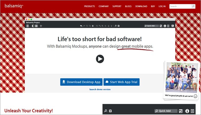
Founded by a former senior engineer of Adobe in 2008, Balsamiq has
appeared to be one of the best wireframing program providers in the industry.
As is advertised “Life is too short for bad software”, Balsamiq Mockup allows
simple elements and fast design creation for websites & mobile apps. It may
have a top limit on the quality of created mockups and the lack of template
window is another downside.
InVision is a US-based company that takes many useful customization and
import options from Marvel, with more collaboration features included. A
highlight is you can share completed mockups through the in-built LiveShare
tool, which is more effective than sending a .PDF file. While this viewer app
is only compatible with iOS devices like iPhone and iPad, with no support for
Android and Windows Phone.
Developed by a team of passionate developers from the orient, Mockplus
is a relatively new player in the industry. It’s a rapid prototyping tool to
turn design ideas into functional prototypes faster, smarter and easier. It’s visualized interactions
and drag-and-drop UI largely simplify the design process and keep designer
focused on the graphic quality and content. Live preview can be achieved by
scanning QR code and the most recent 2.19 version will add 3000 vector icons.
Its educational
offer is awaiting for fresh minds.
Beyond any doubt, there will be other alternatives on the market, with
both pluses and minuses existing the same time. For those who are in need of
testing and analytic tools, here are the recommendations:
A/B Testing Tools, which aim to help test one or multiple elements on certain page to see which received the most action. These types of tools can be purchased on monthly basis. Some popular choices are A/B Test Master, Intuition, UsabilityTools. Web Analytics Tools, whichgive you better understanding of website traffic and visitor behavior from both optimization and conversion perspective. Google Analytics is my tool of choice. User Feedback Tools, which enable you to gather user information and feedback. Some general tools include Mechanical Turk, UsabilityHub and Ethnio.
3. Find Yourself a Mentorship
Mentoring is rewarding, and a high-quality mentorship can be an
important part of a designer’s growth process. You don’t need to catch up as
often with a potential mentor, but try to soak up everything that an
experienced UX designer can offer you when talking on Skype or taking a quick
coffee.
It may be daunting to find a mentor as UX professionals are always
busy, but you may find a mentor through some communities you join or some
courses you take. Take a look at this article on how to find
your design mentor and also consider whether you want to pay for
a mentorship service. It’s true that almost anyone you respect can serve as
design mentor, and just talk to everyone you can and be open to different
opinions.
4. Get Some Experience & Hired
No one can become a successful UX designer without building things.
Almost every UX designer starts with some jobs to practice their skills. That’s
where online portfolio comes in handy. Just like a UI designer would have an A3
portfolio that shows posters, logos as well as t-shirts designed by himself,
you need to present examples of your created deliverables.
It’s great to propose an apprenticeship or internship at a company, and
your portfolio will be a great help that tells a story about the process you
follow will be a great help. Generally, the more you’ve learned, the more
opportunities will open up for you. This could be a virtuous cycle in which you
can learn and grow.
Bottom Line
At last, here’s a quote written by Ivan Glass to share with all people
who have been planning or just wondering to break into the UX world. Enjoy the
ride!
"Nobody tells this to people who are beginners, I wish someone
told me. All of us who do creative work, we get into it because we have good
taste. But there is this gap. For the first couple years you make stuff, it’s
just not that good. It’s trying to be good, it has potential, but it’s not. But
your taste, the thing that got you into the game, is still killer. And your
taste is why your work disappoints you. A lot of people never get past this
phase, they quit. Most people I know who do interesting, creative work went
through years of this. We know our work doesn’t have this special thing that we
want it to have. We all go through this. And if you are just starting out or
you are still in this phase, you gotta know its normal and the most important
thing you can do is do a lot of work."
Please comment below if you have any further thoughts or suggestions to
share.
The mobile app market is saturated with competition. Trends turn over quickly, but no niche can last very long without several competitors jumping onto the bandwagon. These conditions result in a high failure rate across the board for the mobile app market. Only 20% of downloaded apps see users return after the first use, whereas 3% of apps remain in use after a month.
If any part of an app is undesirable, or slow to get the hang of, users are more likely to install a new one, rather than stick it out with the imperfect product. Nothing is wasted for the consumer when disposing of an app - except for the efforts of the designers and developers, that is. So, why is it that so many apps fail? Is this a predictable phenomenon that app designers and developers should accept? For clients, is this success rate acceptable? What does it take to bring your designs into the top 3% of prosperous apps?
The common mistakes span from failing to maintain consistency throughout the lifespan of an app, to attracting users in the first place. How can apps be designed with intuitive simplicity, without becoming repetitive and boring? How can an app offer pleasing details, without losing sight of a greater purpose? Most apps live and die in the first few days, so here are the top ten most common mistakes that designers can avoid.
Only 3% of mobile apps are in use after being downloaded.
Common Mistake #1: A Poor First Impression
Often the first use, or first day with an app, is the most critical period to hook a potential user. The first impression is so critical that it could be an umbrella point for the rest of this top ten. If anything goes wrong, or appears confusing or boring, potential users are quickly disinterested. Although, the proper balance for first impressions is tricky to handle. In some cases, a lengthy onboarding, or process to discover necessary features can bores users. Yet, an instantly stimulating app may disregard the need for a proper tutorial, and promote confusion. Find the balance between an app that is immediately intuitive, but also introduces the users to the most exciting, engaging features quickly. Keep in mind that when users are coming to your app, they’re seeing it for the first time. Go through a proper beta testing process to learn how others perceive your app from the beginning. What seems obvious to the design team, may not be for newcomers.
Improper Onboarding
Onboarding is the step by step process of introducing a user to your app. Although it can be a good way to get someone quickly oriented, onboarding can also be a drawn out process that stands in the way of your users and their content. Often these tutorials are too long, and are likely swiped through blindly.
Sometimes, users have seen your app used in public or elsewhere, such that they get the point and just want to jump in. So, allow for a sort of quick exit strategy to avoid entirely blocking out the app upon its first use. To ensure that the onboarding process is in fact effective, consider which values this can communicate and how. The onboarding process should demonstrate the value of the app in order to hook a user, rather than just an explanation.
Go easy on the intro animation
Some designers address the issue of a good first impression with gripping intro animations to dazzle new users. But, keep in mind that every time someone wants to run the app, they’re going to have to sit through the same thing over and over. If the app serves a daily function, then this will tire your users quickly. Ten seconds of someone’s day for a logo to swipe across the screen and maybe spin a couple times don’t really seem worth it after a while.
Common Mistake #2: Designing an App Without Purpose
Avoid entering the design process without succinct intentions. Apps are often designed and developed in order to follow trends, rather than to solve a problem, fill a niche, or offer a distinct service. What is the ambition for the app? For the designer and their team, the sense of purpose will affect every step of a project. This sensibility will guide each decision from the branding or marketing of an app, to the wireframe format, and button aesthetic. If the purpose is clear, each piece of the app will communicate and function as a coherent whole. Therefore, have the design and development team continually consider their decisions within a greater goal. As the project progresses, the initial ambition may change. This is okay, as long as the vision remains coherent.
Conveying this vision to your potential users means that they will understand what value the app brings to their life. Thus, this vision is an important thing to communicate in a first impression. The question becomes how quickly can you convince users of your vision for the app? How it will improve a person’s life, or provide some sort of enjoyment or comfort. If this ambition is conveyed quickly, then as long as your app is in fact useful, it will make it into the 3%.
Often joining a pre-existing market, or app niche, means that there are apps to study while designing your own. Thus, be careful how you choose to ‘re-purpose’ what is already out there. Study the existing app market, rather than skimming over it. Then, improve upon existing products with intent, rather than thoughtlessly imitating.
Common Mistake #3: Missing Out On UX Design Mapping
Be careful not to skip over a thoughtful planning of an app’s UX architecture before jumping into design work. Even before getting to a wireframing stage, the flow and structure of an app should be mapped out. Designers are often too excited to produce aesthetics and details. This results in a culture of designers who generally under appreciate UX, and the necessary logic or navigation within an app. Slow down. Sketch out the flow of the app first before worrying too much about the finer brush strokes. Often apps fail from an overarching lack of flow and organization, rather than imperfect details. However, once the design process takes off always keep the big picture in mind. The details and aesthetic should then clearly evoke the greater concept.
Common Mistake #4: Disregarding App Development Budget
As soon as the basis of the app is sketched, this is a good time to get a budget from the development team. This way you don’t reach the end of the project and suddenly need to start cutting critical features. As your design career develops, always take note of the average costs of constructing your concepts so that your design thinking responds to economic restraints. Budgets should be useful design constraints to work within.
Many failed apps try to cram too many features in from launch.
Top of Form
Like what you're reading?
Get the latest updates first.
No spam. Just great engineering and design posts.
·
·
·
·
Bottom of Form
Common Mistake #5: Cramming in Design Features
Hopefully, rigorous wireframing will make the distinction between necessary and excessive functions clear. The platform is already the ultimate swiss army knife, so your app doesn’t need to be. Not only will cramming an app with features lead to a likely disorienting User Experience, but an overloaded app will also be difficult to market. If the use of the app is difficult to explain in a concise way, it’s likely trying to do too much. Paring down features is always hard, but it’s necessary. Often, the best strategy might be to gain trust in the beginning with a single or few features, then later in the life of the app can new ones be ‘tested’. This way, the additional features are less likely to interfere with the crucial first few days of an apps’ life.
Common Mistake #6: Dismissing App Context
Although the conditions of most design offices practically operate within a vacuum, app designers must be aware of wider contexts. Although purpose and ambition are important, they become irrelevant if not directed within the proper context. Remember that although you and your design team may know your app very well, and find its interfacing obvious, this may not be the case for first time users, or different demographics.
Consider the immediate context or situation in which the app is intended to be used. Given the social situation, how long might the person expect to be on the app for? What else might be helpful for them to stumble upon given the circumstance? For example, UBER’s interface excels at being used very quickly. This means that for the most part, there isn’t much room for other content. This is perfect because when a user is out with friends and needing to book a ride, your conversation is hardly interrupted in the process. UBER hides a lot of support content deep within the app, but it only appears once the scenario calls for it.
Who is the target audience for the app? How might the type of user affect how the design of the app? Perhaps, consider that an app targeted for a younger user may be able to take more liberties in assuming a certain level of intuition from the user. Whereas, many functions may need to be pointed out for a less tech savvy user. Is your app meant to be accessed quickly and for a short period of time? Or, is this an app with lots of content that allows users to stay a while? How will the design convey this form of use?
A good app design should consider the context in which it is used.
Common Mistake #7: Underestimating Crossing Platforms
Often apps are developed quickly as a response to changing markets or advancing competitors. This often results in web content being dragged into the mobile platform. A constant issue, which you’d think would be widely understood by now, is that often apps and other mobile content make poor transitions between the desktop, or mobile platforms. No longer can mobile design get away with scaling down web content in the hope of getting a business quickly into the mobile market. The web to mobile transition doesn’t just mean scaling everything down, but also being able to work with less. Functions, navigation and content must all be conveyed with a more minimal strategy. Another common issue appears when an app developing team aspires to release a product simultaneously on all platforms, and through different app stores. This often results in poor compatibility, or a generally buggy, unpolished app.The gymnastics of balancing multiple platforms may be too much to add onto the launch of an app. However, it doesn’t hurt to sometimes take it slowly with one OS at a time, and iron out the major issues, before worrying about compatibility between platforms.
Common Mistake #8: Overcomplicating App Design
The famous architect Mies Van der Rohe once said, “It’s better to be good than to be unique”. Ensure that your design is meeting the brief before you start breaking the box or adding flourishes. When a designer finds themselves adding things in order to make a composition more appealing or exciting, these choices will likely lack much value. Continue to ask throughout the design process, how much can I remove? Instead of designing additively, design reductively. What isn’t needed? This method is directed as much towards content, concept and function as it is aesthetics. Over complexity is often a result of a design unnecessarily breaking conventions. Several symbols and interfaces are standard within our visual and tactile language. Will your product really benefit from reworking these standards? Standard icons have proven themselves to be universally intuitive. Thus, they are often the quickest way to provide visual cues without cluttering a screen. Don’t let your design flourishes get in the way of the actual content, or function of the app. Often, apps are not given enough white space. The need for white space is a graphic concept that has transcended both digital and print, thus it shouldn’t be underrated. Give elements on the screen room to breath so that all of the work you put into navigation and UX can be felt.
The app design process can be reductive, rather than additive.
Common Mistake #9: Design Inconsistencies
To the point on simplicity, if a design is going to introduce new standards, they have to at least be consistent across the app. Each new function or piece of content doesn’t necessarily have to be an opportunity to introduce a new design concept. Are texts uniformly formatted? Do UI elements behave in predictable, yet pleasing ways throughout the app? Design consistency must find the balance between existing within common visual language, as well as avoiding being aesthetically stagnant. The balance between intuitive consistency and boredom is a fine line.
Common Mistake #10: Under Utilizing App Beta Testing
All designers should analyze the use of their apps with some sort of feedback loop in order to learn what is and isn’t working. A common mistake in testing is for a team to do their beta testing in-house. You need to bring in fresh eyes in order to really dig into the drafts of the app. Send out an ad for beta testers and work with a select audience before going public. This can be a great way to iron out details, edit down features, and find what’s missing. Although, beta testing can be time consuming, it may be a better alternative to developing an app that flops. Anticipate that testing often takes 8 weeks for some developers to do it properly. Avoid using friends or colleagues as testers as they may not criticize the app with the honesty that you need. Using app blogs or website to review your app is another way to test the app in a public setting without a full launch. If you’re having a hard time paring down features for your app, this is a good opportunity to see what elements matter or not.
The app design market is a battleground, so designing products which are only adequate just isn’t enough. Find a way to hook users from the beginning - communicate, and demonstrate the critical values and features as soon as you can. To be able to do this, your design team must have a coherent vision of what the app is hoping to achieve. In order to establish this ambition, a rigorous story-boarding process can iron out what is and isn’t imperative. Consider which types of users your app may best fit with. Then refine and refine until absolutely nothing else can be taken away from the project without it falling apart.
















%20in%20India.png)
