Showing posts with label font. Show all posts

Tuesday, 20 October 2020

How to Organize a Style Guide

Style guide


How do you organize a style guide? The information architecture of a style guide impacts why people use it, how often they seek it out, and when they think to reference it. The IA also makes some assumptions (or preferably, builds on knowledge) around who the audience is, and what knowledge they have.

In a recent client project we faced this very question, and considered three possible solutions to organize the style guide.


Style Guide by Audience

Some style guides are intended for use across organizations with multiple different audiences: editors, writers, videographers, designers, etc. Or, the organization may have several brands, with guidelines that differ for each.

For these companies, the best way to organize a style guide might be by audience. An audience-driven style guide has the Brand or Titles at the top level, and assumes that the audience will self-identify to dig deeper.

Ben & Jerry’s has content creators working on illustrations, and others using photography. For their style guide the audience is the first consideration.


Style Guide By Guideline

Another way to organize a style guide is by the type of guidelines. Perhaps there are certain guidelines that everyone in the company looks for - such as “Capitalizations”, “Voice and Tone”, or “Grammar issues”. This is particularly likely if the organization has outside writers working for them, who may not become easily familiarized with the basic guidelines.

In these cases, even if there are multiple brands, that designation becomes secondary to the guideline people are likely to search for. Allowing people to easily skim through “Grammar Issues” is helpful when coming up against the serial comma!

Cigna’s Digital Experience Standards are a great example of a style guide organized by guideline.


Style Guide By Content Type

A third way to organize a style guide is by content type. Perhaps your team works in numerous mediums, from video to blogs to press releases to social media. The style, the voice, even the grammatical rules may change from one to the next! Whether the same content creators must bounce between content types, or whether the creators are self-selecting their area of interest, content type is a useful hierarchy when multiple mediums are involved.

Mailchimp’s Voice and Tone style guide showcases how to organize guidelines by content type.


Top UX Courses at Udemy


How Do You Organize a Style Guide?

To choose the best way to organize a style guide you first must consider:

  • How many people are using this? 
  • How do they categorize themselves (e.g. writers vs editors, or videographers vs bloggers)?
  • What common questions do they ask, that this style guide will answer?

With these three questions you’ll be well on your way to determining the architecture and hierarchy of your style guide. 


Share:
Continue Reading →

Monday, 6 February 2017

How to Embed Fonts in Axure prototypes

Axure logo

While working in different kind of operating systems (like iOS, android) or client’s designers have some constraints of using any specific ‘Font-family’. iOS have its own default font family, sometimes client companies have their own style guide for using default fonts. If you are designing prototype in Axure then knowledge of fonts is recommended for you and how to embed any specific font family in your prototype is required for seamless experience. In this article you can have step by step guide in ‘Embedding custom font family in Axure prototype’.

Step 1. Select font which you want to embed in Axure prototype. Let’s say we want to embed ‘Open Sans’ font family.

Step 2. Get the ‘Source URL’ of font from ‘Google free fonts’ of similar other sources.
Google fonts: https://fonts.google.com/ 
Search – Font name and Select. Once you select you will be able to get link of font (see below image).

Google Fonts


Free UX ebook


Step 3. Now open Axure prototype and go to Publish> Generate html.

Axure RP Tool screenshot


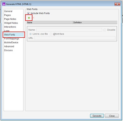
Step 4. Select ‘Web fonts’ tab and add font by clicking on ‘+’ icon below.


Axure RP Tool screenshot


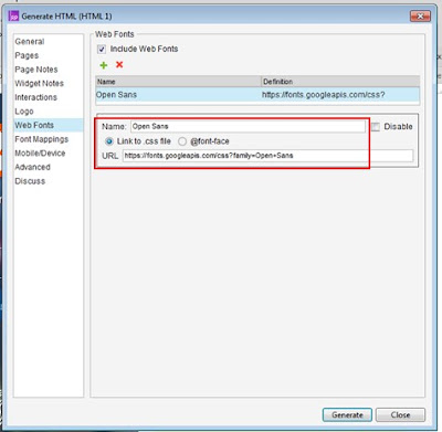
Step 5. Enter the Font name (keep font name exact same with source URL). Enter URL of web font, keep ‘Link to .css file’ as selected.
 Till yet we have done linking of our custom font in our prototype. Now we have to map fonts which we are using in prototype to this (open sans) font. 


Axure RP Tool screenshot

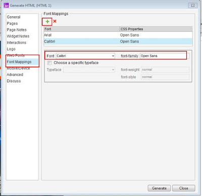
Step 6. Go to ‘Font Mappings’ and click on ‘+’ to add new mapping. Select any font which you want to change in your custom font in ‘Font’ field and enter exact name of custom font family in ‘font-family’. Let’s say we want to replace all the text having ‘Arial’ font in to our font (open sans).

Axure RP Tool screenshot


Step 7. And finally generate prototype and run. You will be able to view your custom font in prototype.


Hope this guide help you in working in Axure prototyping tool. Below are some good recommended online courses which can help you in learning about Axure tool.


Udemy Axure course


Udemy Axure course


Udemy Axure course


About Author

UX Author Abhishek Jain

Abhishek Jain
Design Lead UX Researcher
Co-founder of UXness
LinkedIn | Email


Share:
Continue Reading →

Sunday, 1 November 2015

Tips for designing Usable tickets (Receipt, bills etc.)


People find very difficult in reading information from tickets, bills, receipts etc. like reading seat no. from a movie ticket or reading PNR no. on a railway ticket. Sometimes text are very tiny and sometimes information is not easily readable. Since the information on tickets, receipts, bills is important for a person so it is really important to design Usable tickets. With the improvement in Usability of tickets you can save time, save efforts, reduce frustrations and bring satisfaction in your customers life. There are some recommended points that may help you in designing Usable tickets.

Tips for designing Usable tickets


1. Utilize space properly
A Ticket/bill generally comes on a small size of paper. So utilization of space is really necessary to show the information properly.

2. Group the information
Information presented on a ticket should be grouped properly. First people face problem in finding information on a ticket then reading information comes in to picture. With the help of Gestalt Principles information should be grouped.

3. Associate labels with value
It is a good practice to show information in "Label - value" form. This helps a normal person in understanding information. Not showing labels create a lot of problem.

4. Minimize usage of Watermarks or pattern
The role of watermark & pattern is to protecting your documents/work so that no one can duplicate it or steal it but its usage should be in proper manner.It should not effect your information visibility and text readability. Following points we can keep in mind while keeping watermark and pattern:

    - Keep it in very low opacity just to show a mere presence.
    - It should not over shadow the primary information.
    - It should be placed in appropriate area where the vulnerability is high.
    - Don't use bright colors for watermark and patterns.
    - Hue's of same color can be used  for watermark and patterns.
    - Try to use different techniques for keeping watermarks and patterns for ex: embossing/engraving,        stamping etc.

5. Take care of text legibility
To make text more legible there are few below mentioned points which needs to take care:

    - Choose the right font because different typefaces are designed for different purpose & uses.for  
      ex:some typefaces are designed for headlines not work in small size.
    - Choosing the right number of characters per line will help in increasing legibility. Generally we
      keep 45-75 characters per-line.
    - San Serif typefaces are considered for legible on screen.
    - The counter space in individual letter helps in making it legible.
    - Choose the right contrast between the typeface and the background.Black text on the white
      background is more legible than others.

6. Make important info. prominently
Every ticket or bill has some important information like, imp. information on a movie ticket are Screen no. and seat no. etc. Make important information more prominently and easily legible.

8. 5 second test
You can test any ticket and decide whether design of ticket is good or requires improvement. Show ticket to anyone and ask for some important information and if that person is able to figure out information within 5 seconds then ticket is well designed, if it takes 5-10 seconds then ticket is OK, but if it takes more than 10 seconds then ticket design requires improvements.

Ex. Take a railway ticket and ask anyone to read the passenger seat no. and check how much time he/she takes in getting seat no. if it takes less than 5 seconds then ticket is well designed.

9. Make tickets accessibility complaint
It is really very important to design tickets for 'Disabled' people with accessibility complaint.
Specially visually impaired person should be able to get information from a ticket. For important information you should provide a info. written in braille language with embossed paper format.


Share:
Continue Reading →