Published on 03 Aug 2024
Design is not just about aesthetics; it's about creating experiences that are intuitive and meaningful. The Gestalt principles, rooted in psychology, offer valuable insights into how people perceive visual elements. These principles guide designers in crafting interfaces that are not only visually appealing but also easy to use and understand. This article explores how Gestalt principles influence visual and UX design, enhancing user experiences through psychology.
What Are Gestalt Principles?
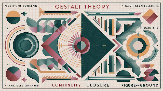
Gestalt principles are a set of rules that describe how humans perceive and organize visual elements into coherent groups or wholes. Originating from Gestalt psychology, which emerged in the early 20th century, these principles explain how we naturally tend to simplify complex images into more digestible forms. The key principles include proximity, similarity, continuity, closure, figure-ground, and common fate.
The Gestalt Principles - IxDF
Gestalt Principles are principles/laws of human perception that describe how humans group similar elements, recognize patterns and simplify complex images when we perceive objects. Designers use the principles to organize content on websites and other interfaces so it is aesthetically pleasing and easy to understand. - IxDF
How Gestalt Principles Influence Design
1. Proximity
Proximity refers to the idea that objects close to each other are perceived as a group. In design, proximity helps create relationships between elements. For instance, grouping related buttons together in a user interface indicates that they belong to the same category or function.
Design Application:
- Navigation Menus: Grouping related links closely together within a menu helps users understand the hierarchy and relationships between different sections.
- Form Design: Placing labels and input fields close to each other clarifies which label corresponds to which input.
2. Similarity
Similarity suggests that elements that look similar are perceived as part of the same group. Designers use similarity to create patterns and establish visual coherence. This can be achieved through color, shape, size, or texture.
Design Application:
- Buttons and Links: Using the same color and style for all clickable elements helps users identify actions quickly.
- Iconography: Consistent icon styles across a platform enhance recognition and familiarity.
3. Continuity
Continuity implies that the human eye follows paths, lines, and curves in a design. We naturally tend to follow a continuous line or pattern, which helps guide users through a visual narrative.
Design Application:
- Flow Design: Use lines or arrows to guide users through steps in a process, like a checkout flow or onboarding sequence.
- Content Layout: Aligning text and images along an implied line creates a seamless reading experience.
4. Closure
Closure is the principle that our minds fill in missing information to perceive a complete shape. This allows designers to create complex shapes with minimal visual cues, knowing that users will mentally fill in the gaps.
Design Application:
- Logos and Icons: Designers can create minimalist logos by implying shapes with strategic gaps, making them memorable and distinct.
- Infographics: Use incomplete shapes or outlines to guide the viewer's eye and suggest connections or relationships.
5. Figure-Ground
Figure-ground describes the tendency to separate objects (figure) from their background (ground). This principle is crucial for focusing user attention on the most important elements of a design.
Design Application:
- Call-to-Action Buttons: Contrast buttons against their background to make them stand out and attract clicks.
- Modal Windows: Dim the background when displaying a modal to focus the user's attention on the active content.
6. Common Fate
Common fate suggests that elements moving in the same direction are perceived as related or part of the same group. Although primarily observed in motion, it applies to static designs with implied movement.
Design Application:
- Carousel Sliders: Animate images or content in the same direction to show they belong together.
- Progress Indicators: Use motion or direction to indicate a process flow or sequence.
Enhancing UX Design with Gestalt Principles
Gestalt principles are invaluable for creating user interfaces that are not only aesthetically pleasing but also intuitive and easy to navigate. By understanding how users naturally perceive visual elements, designers can:
- Improve Usability: Create interfaces that users can understand and interact with effortlessly.
- Enhance Visual Hierarchy: Direct user attention to the most important elements, such as calls to action or key information.
- Build Consistency: Maintain a cohesive look and feel across different pages or screens, aiding recognition and familiarity.
- Reduce Cognitive Load: Simplify complex information by organizing elements into easily digestible groups.
The Gestalt principles are a powerful tool for designers looking to bridge the gap between aesthetics and functionality. By leveraging these psychological insights, designers can create visually appealing and user-friendly interfaces that resonate with users on a deeper level. Whether you're designing a website, app, or any visual communication, understanding and applying Gestalt principles can significantly enhance the user experience. As you integrate these principles into your design process, you'll find that they not only improve usability but also create a more engaging and memorable experience for users.
Further readings
Top 10 must read UX Design Blogs
Logo Design trends that never go out of style
UX Surveys: Ultimate Guide


%20in%20India.png)