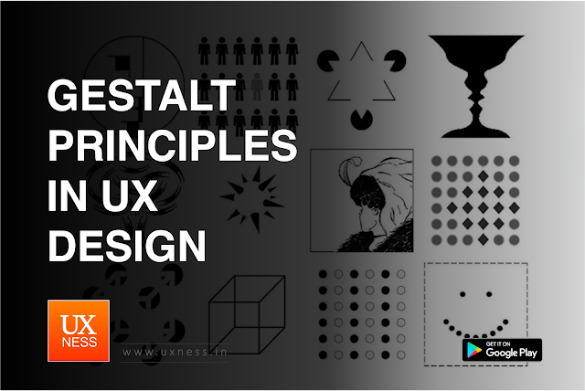
Gestalt principles are a set of perceptual principles that describe how humans organize visual information. They can be used to create more effective and user-friendly interfaces. These principles are often applied in various design fields, including user experience (UX) design, to create more effective and user-friendly interfaces.
Gestalt Principles in UX Design:
Proximity
The principle of proximity states that elements that are close together are perceived as belonging together. This principle can be used to group related elements together, such as navigation links or form fields. For example, a website might have a navigation bar at the top of the page with links to different sections of the site. These links are positioned close together to indicate that they are related.
Application: Group related elements together on a user interface to visually communicate their relationship or association.
Similarity
The principle of similarity states that elements that are similar in appearance are perceived as belonging together. This principle can be used to create visual hierarchy and emphasize important elements. For example, a website might use different colors or fonts for different types of content, such as headings and body text. This helps users to quickly scan the page and identify the most important information.
Application: Use consistent colors, shapes, or styles for related elements to indicate their similarity and create a cohesive design.
Continuity
The principle of continuity states that our eyes tend to follow smooth lines and curves. This principle can be used to guide users through an interface and direct their attention to important elements. For example, a website might use a breadcrumb trail to show users where they are located in the site. This helps users to keep track of their progress and navigate back to previous pages.
Application: Use lines or curves to guide the user's eye through related elements or content. This can be applied to flowcharts, timelines, or navigation pathways.
Closure
The principle of closure states that our brains tend to fill in missing information and complete incomplete shapes. This principle can be used to create visual interest and make an interface more memorable. For example, a website might use a logo with a negative space element, such as a circle with a missing segment. This helps users to remember the logo and identify the brand.
Application: Create visual connections between separate elements to form a unified whole. This can be particularly useful for navigation menus or multi-step processes.
Figure-ground
The principle of figure-ground states that we tend to perceive objects as being either in the foreground or background. This principle can be used to create contrast and make important elements stand out. For example, a website might use a dark background with light text to make the text more readable. This helps users to focus on the content and avoid distractions.
Application: Clearly differentiate between foreground and background elements to improve visual hierarchy and make important information stand out.
Prägnanz
The principle of prägnanz states that our brains tend to organize information in a way that is simple and regular. This principle can be used to create interfaces that are easy to understand and use. For example, a website might use a grid layout to organize content. This helps users to scan the page and find the information they are looking for.
Application: Logo Design, industrial design, architecture design, photography and art etc.
What is Expert Review in UX Design
What is Contextual Inquiry


