
Introduction
Nowadays, everyone is using mobile phones and glued to them. On average, people check their phones 221 times every day. It is now the primary way of communicating with friends and family, online shopping, ordering food, playing games, and so on. Source
According to statistics by edume, smartphones are used by 80% of the world's population. With having that extent of accessibility, today mobile users are growing exponentially. The user experience is enhanced. It encompasses users’ perceptions and feelings before, during and after their interaction with cellular devices. Mobile learning is a new means of accessing mobile learning content. Let’s take a plunge into mobile learning and know more about its role in user experience. Source
What is mobile learning?
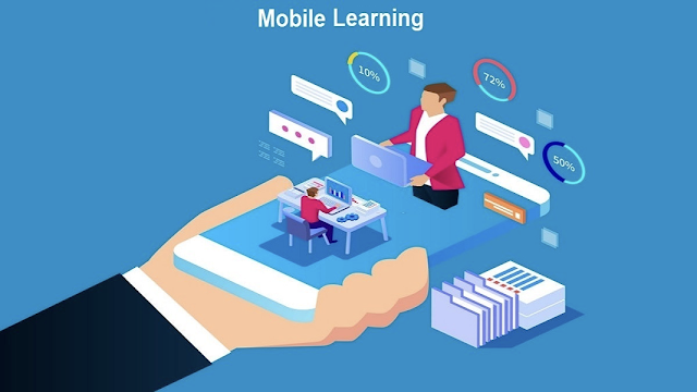
The new means to access learning content through utilizing mobile devices is mobile learning, often known as M-learning. You can learn whenever and wherever you want, provided that you have a mobile device connected to the internet.
There is a growth of mobile users and mobile use. The number of mobile users and the amount of time they spend on their phones is on the rise. With more people doing more things on their phones, the focus then comes on how to improve the individual components that make up the mobile user experience.

When there is a massive increase in adoption to mobile users, it then becomes really important to improve the user experience. Therefore, creating delightful mobile user experiences pushes us to reconsider a lot of what we've taken for granted in desktop design. Mobile-specific concerns, such as small screens, wide variances in device characteristics, usage and connectivity limits, and the difficult-to-identify-but-ever-changing mobile environment, all add to the complexity.
When designing for mobile, designers must first determine whether to create a single design that fits all devices or numerous versions tailored to different screen sizes. Responsive design is the first type. Adaptive design is the second. Typically, the first approach is to design for the smallest gadget and build up from there (smartphones to tablets, etc.). Then web standards (W3C's) are followed, and as many browser kinds as feasible are supported. It's critical to concentrate on context, ease of use, conciseness, and consistency.
Designing for mobile includes many things to consider, and while many are conventional UX factors, there will also be mobile-specific design considerations. Will your mobile offering be integrated with your current offering? If it does, will you use the responsive or adaptive design?
With learners seeking access to learning at all times and on any device, delivering e-learning that can be accessed on any device has become critical. Adaptive and responsive design are the options; there are distinctions between the two. Knowing them will assist you in selecting the best option. There are two primary approaches to developing asynchronous content for delivery across a variety of mobile devices.
Adaptive Design
It's a style of design that adapts the layout of an online course to the device on which it's being watched. The layout of the screen changes depending on the device being used to view the material - desktop, laptop, tablet, or smartphone.




%20in%20India.png)
