
There’s a science as to why particular designs catch your eye and get your blood pumping.
The human brain is lazy, biased, and prone to shortcuts.
The user experience study of human cognition can be mushy, unscientific, and filled with false assumptions—perhaps it’s the fault of a lazy brain.
Cognition is complex, and many factors play into gut reactions or an instant impression. When you ask someone, “Why’d you do that?” there’s a high chance they won’t be able to answer or that you’ll misinterpret their response.
Enter neuroscience.

While research methods like observation and interviewing often require the UX researcher and participant to make guesses, modern technology like eye tracking allows researchers to study nearly imperceptible reactions and preferences.

In the case of products with substantial traffic, seemingly tiny details like the width of a button or the color contrast of text can make millions of dollars of difference. That’s why tech giants like Facebook and Google are beginning to employ neuroscience-based techniques to study how people use their products.
Let’s start with an introduction to reactive, “fast thinking” and provide a few tips for designers to help leverage the power of neuroscience in order to create great user experiences.
Design Psychology: Fast Thinking, Slow Thinking
It is no secret that much of what drives human behavior is subconscious. In the milliseconds after a person encounters a new app or website, millions of neurons fire and the brain makes hundreds of subconscious decisions.
Am I in the “right” place? Should I trust this site?
YouTube UX Researcher Javier Bargas-Avila determined in a 2012 study that people form aesthetic reactions to a web page in the first 17 to 50 milliseconds after exposure.
To put that into perspective, it takes the eye 300-400 milliseconds to blink. Your product may receive its trial, judgment, and sentence all in less than the blink of an eye.
These impressions might not register, but they do impact behavior. For example, if a site loads slowly and the brain reads the first items that load as “off-topic” the user may navigate away immediately rather than wait for the site to load.
Companies like Facebook invest significant resources into studying load order of elements. If someone logs into Facebook and doesn’t see any notification badges, they may navigate away instantly. If the badges load first, they may wait while the content-heavy News Feed loads.
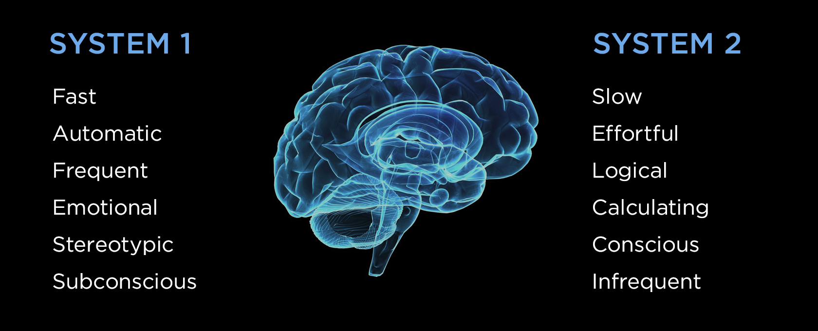
Nobel laureate Daniel Kahneman’s book Thinking, Fast and Slow breaks human thought and decision making into two systems to help illustrate the difference.
DISCLOSURE: This post may contain affiliate links, meaning when you click the links and make a purchase, we receive a commission.

System 1: fast, automatic, frequent, emotional, stereotypic, subconscious.
System 1 thinking is reactive—responsible for complex but instinctive cognition like determining the distance between objects or determining emotional responses. Your lazy brain generally defaults to System 1 thinking.
System 2: slow, effortful, logical, calculating, conscious, infrequent.
System 2 thinking is analytical and is applied to more complex scenarios, like determining appropriate social behavior or comparing two products with different prices and characteristics.
Since the brain doesn’t want to re-process information or make novel decisions every time it is faced with a new scenario, much of human decision-making falls into System 1, or “fast thinking.”
When making decisions quickly the brain can over-rely upon schemas or mental models—familiar patterns of information and interaction. When System 1 thinking is engaged, System 2 never kicks into effect. People may not be aware of their brain’s decision-making shorthand, but it strongly impacts their behaviors and perception of the product.
The Science of Psychology in Design
The human brain consumes a whopping 25% of the body’s oxygen despite making up only about 2% of its mass. The brain is lazy as a survival mechanism—pattern recognition and shortcuts mean less energy spent consciously processing the situation. The brain identifies things, labels them, and ignores them until they’re relevant again.
The brain’s preference for patterns and lazy decision making might make survival easier, but it makes UX design more difficult. How do you study something your research subject can’t even perceive?

A handful of neuroscience techniques have recently made the jump into UX research, helping researchers shed light on the things that stimulate “fast thinking.”
Attention and perception can be studied with eye-tracking cameras. Emotional response and arousal can be determined with skin sensors or facial analysis. Electrical response in the brain can be measured with electroencephalography.
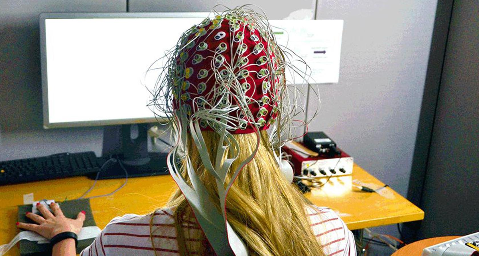
An electroencephalogram (EEG) is a test that
detects electrical activity in the brain.
To designers, it might sound like an impossible task to capture someone’s interest and convey vital information in less than the blink of an eye. Luckily, just as neuroscience can help us diagnose problems, it can also reveal general solutions and best practices.
Here are a few general lessons learned from neuroscience user experience research that designers can employ when designing digital products.
Design Psychology Tip #1: Make It Easy to Identify
Everyone arrives at a website or an app with some expectation of what it should look like. Staying close to that expectation helps designers benefit from instant subconscious decision making.
The person who opens your app or website wants to know a) does this have what I am looking for; and b) is this high quality? Keeping designs simple and keeping brand, services, and products front and center help people orient themselves.
Putting some information front and center means keeping other information from crowding it out. Decluttering a design is just as important as re-arranging components.
You’ll notice a movement across tech companies to simpler, less crowded interfaces. These minimalist designs outperform more complex designs in task completion and visual clarity is shown to impact purchasing decisions on and offline.
It’s been scientifically proven that visually simple and clean designs perform better. The lazy brain can grasp the site’s purpose instantly and understand what action to take.

Noise vs. calm. Google has optimized their
site to draw the user's eye to their logo and encourage interaction with the
search box. In 2017, they held 80.5% of total web search traffic, up from 65.5%
in 2016.
Design Psychology Tip #2: Indicate What’s Coming
Priming, or preparing someone for some upcoming information or interaction can improve the user’s ability to understand and react to new information. You can prime someone to expect things like elements of the UI, certain interactions, or timing in a process.
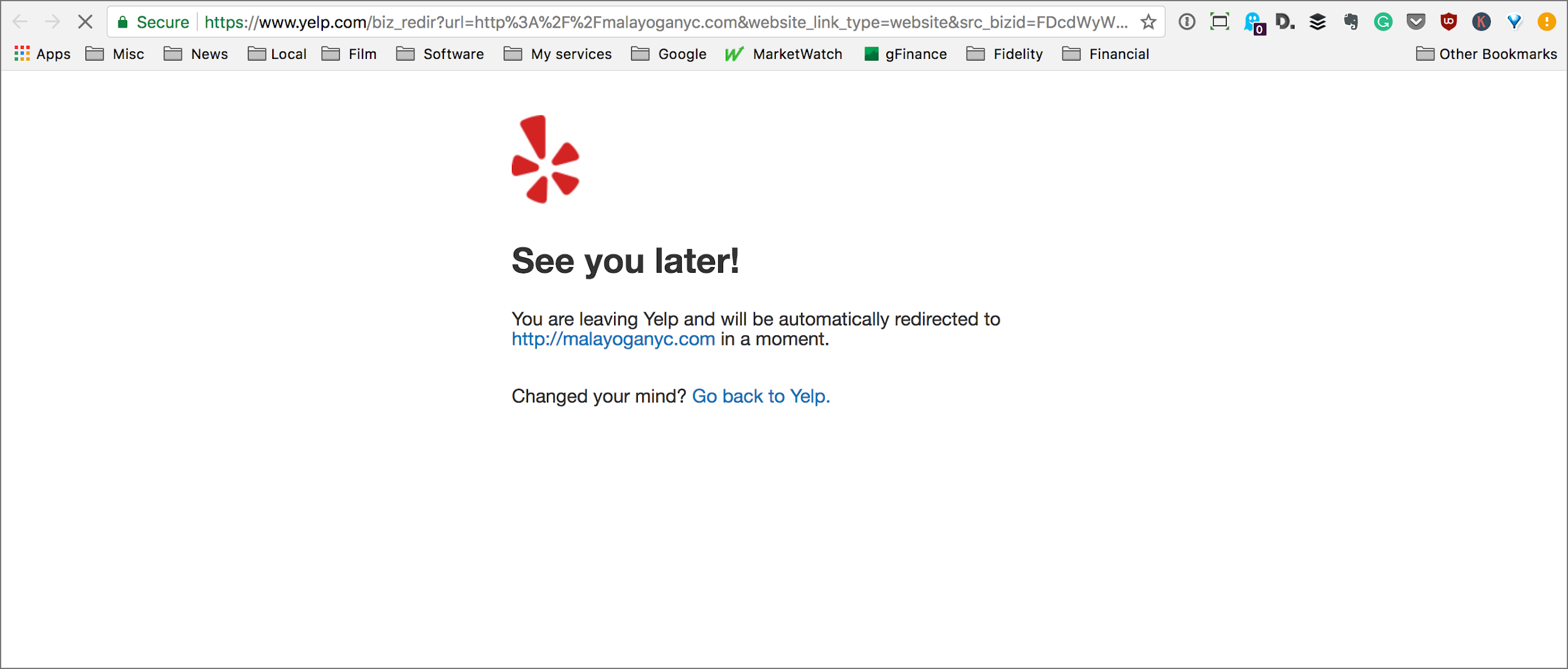
For example, Yelp uses an additional screen to alert users they are leaving Yelp to visit a third-party site. The additional context helps signal the user to expect a new design and information architecture.
Priming is a double-edged sword. Information you do not mean to communicate can still impact decision-making. For example, if your photography company only features pictures of babies, a person might incorrectly snap to the assumption that you serve infant clientele only.
Design Psychology Tip #3: Organize for Lazy Readers
Eye tracking studies are able to follow a person’s gaze as they interact with a product. They can produce heat maps that show the length of time spent focused on one part of the screen, or maps of how the eye jumps around the page.
We know that, across industries and app types, the brain commonly scans for information in an F-pattern (or E-pattern). The person looks at the information at the top, reading to the right, and then scanning down the page for relevant information or icons.
Breaking the F-pattern—for example, putting important information in the bottom-right corner—will make it harder to find.

Eye-tracking heatmaps show the length of time
participants focused on each part of the page. Notice the F-pattern to the
attention, and that attention drops off as the person moves down the page.
Tame Your Text
According to a Nielsen Norman study of 45,237 page views, people read only about 20% of the text on a page. Worse, on sites with more content, people dedicated only about 4 extra seconds for each additional 100 words of text.
In a world where people don’t read word-for-word, Nielsen Norman employs the following guidelines for scannable text.
- Highlighted keywords
- Meaningful subheadings
- Bulleted lists
- One idea per paragraph
- The inverted pyramid style—start with the conclusion
- Half the word count (or less) of conventional writing
The sheer amount of text on this site is hard
to absorb—the user may exit immediately rather than keep reading. The text is
uniform without bolding or bullets. The section titles are generic, making it
hard to parse accurately without reading.
Work with Color Pop and Contrast
Text organization and location are not the only important factors in design. Color theory, weights, and contrast can be used to direct user attention.
NASA’s cockpit design team uses luminance—or the perceived brightness of a design—to help manage the pilot’s attention in an area crowded with competing information. The cockpit design team uses color and contrast to give visual prominence to the most important elements.

Luminance, and contrast, can be used across your product to highlight or downplay specific information, but it is most often referenced in button or call-to-action design. As you can see in the red example buttons below, though the button in the top left corner is the most saturated, it “feels” the brightest because the contrast is the highest.

Contrast and luminance are just a first step. Color theory suggests balancing your product’s colors by using the dominant color 60% of the time, secondary 30%, and accent 10%. This breakdown is consistent with the neuroscience behind what draws the eye. Because the accent color is used the least, it draws the eye the most.

Just as the use of bright color can draw the eye, use of more muted colors can help a user determine which information is secondary or less important. For example, most websites use footer areas with a more neutral color to show separation from the rest of the information on the page.
Any features or information designers de-prioritize help the user focus directly on the most import interactions or information.
Most websites use muted colors at the bottom
to denote navigation or reference material. The brighter colors in the center
signal to the user that they are the most important information.
Design Psychology Tip #4: Gut Check
Luckily you don’t need thousands of dollars of eye-tracking software or an electroencephalogram to tell if a design is working.
5-second tests are a powerful tool for determining whether or not your designs are instantly understandable.
In a 5-second test, the participant views a site or app for 5 seconds, then responds to questions about the subject matter and design. Unable to refer back to the image, the participant gives their “impressions”—what participants assumed was the purpose and function of the product, and what they would do or where they would look for next steps.
Your product might have all the functionality your user desires, but if the
lazy, pattern-loving brain can’t instantly grasp that, it will move on.
lazy, pattern-loving brain can’t instantly grasp that, it will move on.
Designers as “Mind Readers”
As we learn more about design psychology, the brain, and perception, design norms will continue to change across the industry. The connecting thread is data—as methods for the study of neuroscience and cognition improve, so will the type and quality of data available for UX design.
Great user experience design isn’t magic—it’s science. Neuroscience.
This article was written in collaboration with UX researcher Caitria O’Neill, previously at Facebook and a fellow at Stanford’s d.school
Article originally posted here
About Author
Miklos Philips
Principal UX Designer @ Toptal


