My story with Mockplus began when I started using it half
one year ago, and I was so deeply impressed by its simplicity & efficiency
which could be incomparable with other prototyping
tools. Most recently, it will release a big update (so-called 2.3 version), and this could be another one
giant leap forward for this tool that I've been witnessing.
I always believe that Mockplus is an excellent prototype
design software that has been dedicating to better user experience always the
time. And its feature "Simplicity and Efficiency" is so distinctive
that this tool has to give up some highly-personalized and complex functions.
Mockplus, this time, proves its dedication and vision again in this new update.
In the new 2.3 version, the most intuitive change we can see
is the project bar has been moved from the right to left side and the
components' property box has taken the entire right sidebar. That will add much
convenience while setting properties.
On the other side, this change may make regular users feel
unfamiliar more or less. Then, why to make this change? From my own perspective
of view, I think the reasons can be the followings:
1. This can free up more design space. There are only two
panels on either side and the design canvas in the middle will be much larger
accordingly.
2. All interactions can be done on the right-hand panel,
allowing us to set the components' interaction and the page link in one place,
instead of two separate places.
3. It's much easier to set some common properties (like text
font and font size) as well as common operations (layout, alignment, etc).
Plus, I notice that many new attributes have been added to
components. For instance, it adds rounded corners for Tab component, label
color and border, rolling and many more attributes. Moreover, I find that more
components have border-related property settings. For instance, it's possible
to set the border when the Shape component in the rounded corner. These
attributes definitely make components much flexible and adaptive to more
scenes, all contributing to better serve our design ideas.
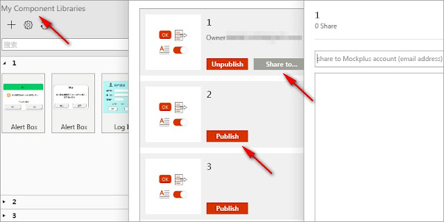
Another highlight in this update is the components' library
synchronization and sharing. The "Library" feature allows we
designers to add, remove or modify our customized "Components",
"Groups" and "Pictures", etc. Meanwhile, we can publish and
sync our own component libraries to the cloud. Most importantly, we are capable
of sharing libraries with others, which will be a big plus for team
collaboration.
Also, there is no doubt that these user-customized component
libraries will get more and more rich, and Mockplus users can directly modify/use
various types of finished/semi-finished components with least efforts. To some
degree, this feature may become a form similar to the network community,
enabling users to work, learn and communicate with others via their own
component library. Of course, this would be some distant visions, but we can
use the Mockplus official public library to enrich design needs.
This new update adds up to 200 icons and provides more
choices for graphic designers, saving much time searching and designing UI
elements. Also, the 2.3 version supports the weight of font style, and to my
delight, the unsupported Roboto font is supported this time. Let's take a look
below:
Furthermore, users will have the ability to view version
history and set protect password for cloud project management. It's allowed to
customize the zoom ratio of design canvas, and to apply different widths for
different pages in Web project.
Not only does this new version add some properties and
functions, but also fixes a certain amount of problems. As far as I'm
concerned, it fixes the issues that the keyboard cannot disappear and the
images look blurry on the mobile phone, along with the issue that interactive
targets may be lost while copying and pasting, etc.
It seems that there's nothing more eye-catching other than
the component library, but the truth is the icons, component properties as well
as the richer functions should be a further interpretation of Mockplus's focus
- the user needs. From my personal benchmark, the new update is like an old and
loyal friend who come over and say "Hey, tell me your troubles and I will
nail it"! Instead of pushing us to learn it continuously, Mockplus is
always in constant adaptation to user needs and solve user's troubles. That's
why I like it.
I'd like to compare this tool to an independent assassin,
because it's too focused on their own characteristics as a prototype design
software. "He" only walks on his own way, never seeing anything;
"he" only does what he will do, no superfluous. Its focus brings both
people's love and annoyance: love he's not chasing fame and interests, but also
get annoyed by this beginner's mind. But perhaps because of his focus, suddenly
on one day when he abruptly looks back from his own small road and finds that
he has already embarked on high hill.
About Author
Berry Sarah
Email: berry@jongde.com Enthusiast for developing #prototypingtools, hoping to make friends with all like-minded guys. #ux #design #prototyping.


%20in%20India.png)