Showing posts with label data representation. Show all posts

Wednesday, 1 June 2022

What is Information Architecture?


  1. The art and science of structuring and classifying web sites, intranets etc. to help people find and manage information.
  2. Information architecture is concerned with creating organizational and navigational schemes that allow users to move through site content efficiently and effectively.
  3. The combination of organization, labeling, and navigation schemes within an information system.
  4. The structural design of an information space to facilitate task completion and intuitive access to content.
  5. Information architecture on the Web is closely related to the field of information retrieval: the design of systems that enable users to find information easily.
  6. Information architecture is concerned with how people cognitively process information.

Components of Information Architecture

  1. Organization systems - How you categorize and structure information. E.g. chronological, topics etc.
  2. Labeling systems - How you represent information. E.g. scientific terminology (Amend Order) or lay terminology (Edit Order)
  3. Navigation Systems - How users browse or move through information. E.g. clicking through a hierarchy, through sections etc.
  4. Search Systems - How users look for information. E.g. autosuggest, index etc.

Approaches of Information Architecture 

Information architecture requires creating categorization schemes that will correspond to business objectives for the site, user needs, and the content that will be incorporated in the site. 

UX Design


We can tackle creating such a categorization scheme in two ways: from the top down, or from the bottom up.

The elements of User Experience Design

Top-down approach - 

A top-down approach to information architecture involves creating architecture directly from understanding product objectives and user needs. We started with the broadest categories and then break these into subcategories. This hierarchy of categories and subcategories serves as the empty shell into which the content and functionality will be slotted.

Top down Information Architecture approach

Bottom-up approach - 

A Bottom up approach to information architecture involves creating architecture directly from analysis of the content and functional requirements .We group items together into low-level categories and then group those into higher-level categories, building toward a structure that reflects our product objectives and user needs.

Bottom up Information Architecture approach

Deriving information architecture – Card Sorting 

Card sorting is a method used to help design or evaluate the information architecture of a site. In a card sorting session, participants organize topics into categories that make sense to them and they may also help you label these groups. Card sorting helps us gain valuable insight about the structure of data.

There are two common card sorting techniques: 

1. Open card Sort -

In open card sorting, each participant is given a stack of cards. The participant is then asked to group those cards together any way they want. Then they make labels for the groups they created.

Open card sorting

When to Use Open Card Sorting – It’s beneficial to use open card sort when you are starting with the new project. In this way you will not introduce your own biases into the grouping of items and will see the information organized from other people’s perspectives.

Disadvantage of open card sorting – Sometimes it can be too vague as their might be many categories as participant has freedom to arrange and label the category .In this case it might be difficult to analyze the data and reached to any conclusion.

2. Closed Card Sort -

In closed card sorting, the researchers create the labels for the groups. Participants are given a stack of cards and are asked and are asked to put each card into a group.
Closed card sorting

When to Use close card sorting – If you already know what categories you want to sort items in, then closed card sorting is the obvious choice. Closed card sorting additionally removes the burden from the participants having to come up with their own group labels, which simplifies the activity for them.

Disadvantage of close card sorting – Using pre-determined group labels gives you less information because the participants’ choices are confined by the category labels you create. That, in turn, limits the chance of you seeing alternative approaches to the categorization of your items.

Using Both Open Card Sorting and Closed Card Sorting

Conducting open card sort first help you determine category names for each group of content, and to understand the different ways participant can group the items. Then, after analyzing the results, you can conduct closed card sorting to validate the interpretation of the results.

Online Tools 

Optimalsort  , User Zoom , Concept Codify, xSort , UXSort, Simple card Sort.

Check best card sorting tools> 


Share:
Continue Reading →

Monday, 4 January 2021

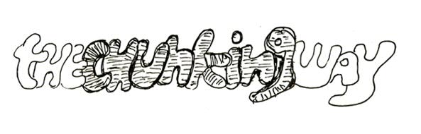
The Chunking way

Chunking


Have you ever tried to remember a very long number and that still resides in your head? I'm sure that might be a challenge in doing so!. Our brain works really hard to memorize certain things like remembering the huge and long information unless we practice a number of times or try to note down somewhere.

Why our brain is so snoozed at memorizing extensive things? 

Here are a few clarifications about our brain, how it is really going to work. Firstly, our brain consists of Long-Term Memory & Short-Term (Working) Memory. Now let us know, how exactly the human brain going to work on retaining memory. Basically memories are stored as the minute chemical changes at the connection points between neurons in the brain and this connection point is called as Synapses.

These fragments (synapses) responsible for storing and transmitting the information. The parts of the brain that receive these electric impulses are dendrites. Through this information or electrical impulses flow through the neural network of the brain. By this activity of the neurons, which in turn causes these connection points (synapses) to become stronger or weaker in response.


This process of strengthening, and weakening of synapses is how exactly the brain stores the information. And to have an exceptional memory, you may need to go through such flow of connections eminently, which in turn that it could be in that kind of process through neural networks. If the information has processed in this pattern for several times by creating a tracing a mark, that information could dwell permanently in our brain. In fact, in turn doing it, we are actually pushing information further from Short-Term memory to Long-Term memory. By doing so, we are indeed storing information as a memory.

Short-term memory is an essential step toward the next stage of retention for long-term memory. The effort taken to push information from Short-Term memory to Long-Term memory is a procedure, this is how the first information has to be stored in Short-Term memory.

It can only hold a little amount of information (typically around 7 elements or even less than that) in our mind, which is in turn a readily available and in the active mode for a short period of time, ranging between 10 to 15 seconds, or at max of one minute. Now the biggest challenge is how we can achieve it. Chunking is one of the methods which help us to retain the information in the brain.

What's chunking  or chunking psychology then? 

Chunking is the sequence of materials into shorter meaningful groups to make them further manageable. For example, a hyphenated phone number, split into groups of 3 or 4 digits, tends to be easier to remember than a single long number.

The maximum number of chunks that can be efficiently processed by short-term memory is four, more or less. For example, most people can remember a list of five words for 30 seconds, but few can remember only a list of ten words for 30 seconds.


DISCLOSURE: This post may contain affiliate links, meaning when you click the links and make a purchase, we receive a commission.

Top UX Courses at Udemy


Method of Chunking

It is the procedure of making more efficient use of short-term memory by grouping and organizing the pieces of information together. This can be used precisely only on the important information need to be chunked. If the short-term memory is stocked up, the new information will just fade away. 

Method of Chunking

When not to Chunk 

Well, Chunking is often applied as an ordinary technique to simplify method. This is a probable misdeed of the principle. That's the way it can lead to make things tough to scan. If the chunking is applied extensively, since the focus is on the group of items and not the individual items themselves. However, if you apply the concept in combination with other principles it can be used effectively to make more grouping easier to process. The limitations specified by this principle deal specifically with tasks involving memory. Chunk information could be available, when people are required to recall and retain the important information. And also when information is used for problem solving. Do not chunk information that is to be searched or scanned.

So, Designer needs to be smart enough while making decision wisely in chunking information.
 How do you chunk in your designs? Please share your thoughts. 

About Author

Srinivas Ramshetty is Ux evangelist and senior ux consultant at Intergraph. He played multiple roles in the areas of Competency Building, Managing & Leading Ux teams, User Research, User Interface Design, Interaction Design, Information Architecture, Usability Testing and Analysis across multiple business verticals while serving fortune 100 corporations. Srinivas is the certified Usability Analyst from HFI and pursuing Masters in Psychology.

Share:
Continue Reading →

Saturday, 30 May 2020

UX & Virtual Reality - Designing for interfaces without Screens


Virtual Reality

It’s an experience that’s been around since the mid­ 80s, but technology always seemed to hold it back. The advances in smartphones and related technologies have finally brought the incredible potential of VR within reach. Now, we’re in the midst of a virtual reality revolution. The concept was coined around 1955 and so many years later VR is back in a big way with Oculus, Samsung Gear VR, Project Morpheus, Google Cardboard, HTC Vive, OSVR, and other smaller or yet to be announced players. The well-known tech giants Facebook, Google and Microsoft are keenly investing in VR which indirectly proves that it is going to be the game changer of this century.

virtual reality, wearables, technology, VR, UX


What are they trying to do with VR?

It’s really just immersive software. You know how your phone is a tiny screen that you sometimes ignore? Virtual reality is pretty much the opposite. It uses a headset (a big pair of glasses) that fills your entire field of view with an image. You turn your head left, you see left. Turn your head right, you see right. You will be framed inside a virtual world with virtual things with which you can interact, play, design and experience.

virtual reality, virtual projection

The VR Process

Designing for a flat 2D screen versus designing for 3D Virtual Space has its own challenging factors. Achieving the best user experience in VR Devices is the key success of the entire concept. As it is a combination of various factors such as Head Movement Tracker, Eye Tracker, Gesture Capture, Mind Map etc., making all these sync together and binding them perfectly with the design and visuals of your application takes a lot of effort and thought process.  

Who can utilize VRs?

Everyone. Yes, VR Headsets are of 3 categories affordable for all set of people around the world. Every single application that you are using in your mobile phones and computers can be designed for Virtual Reality. There is a big misconception among the people saying that VR is favored only for Game Development, which is totally wrong. Interior Designers, Doctors, Industrial Designers, E-Commerce, Banking and every other random line of business can use Virtual Reality for their work.

1. The low-end entry level headset. It’s actually just a fancy smartphone case. You slip your phone into pair of lenses that strap onto your head like a scuba mask, and there you go, you’re into the VR world! You can build these things out of plastic, or even, as Google demoed some years back, Google Cardboard. Samsung has one such model on the market today for $200.


2. The mid-range headset. It’s totally self-contained, like an Oculus Rift or Sony's Project Morpheus, with its own display and probably some headphones. Think of it as a really nice TV or computer monitor for your face. Maybe you plug it into a phone or a PC to play games or watch movies. Oculus which is acquired by Facebook is selling its latest dev kit.

3. The Augmented Reality. It is one step ahead of the Virtual Reality where we are binding the real world visuals with virtual stuffs. Imagine, you walk on the road and you can see the visuals, pins, navigations of the Google Map on your path. Two Big companies, Microsoft with its HoloLens and a headset by Magic Leap are trying to accomplish this concept.

Virtual reality weather updates


UX Principles for designing Virtual Reality

1. Everything Should Be Reactive 
Every interactive object should respond to any casual movement. For example, if something is a button, any casual touch should provoke movement, even if that movement does not result in the button being fully pushed. When this happens, the haptic response of the object coincides with a mental model, allowing people to move their muscles to interact with objects. When designing a button: use a shadow from the hand to indicate where the user’s hand is in relation to button, create a glow from the button that can be reflected on the hand to help understand the relationship, use sound to indicate when the button has been pressed (“click”) 

virtual reality in medical


2. Restrict Motions to Interaction
The display should respond to the user’s movements at all times, without exception. Even in menus, when the game is paused, or during cut scenes, users should be able to look around. Avoiding Simulator Sickness and slowness is the key part of improving the UX in Virtual Reality Applications. Do not instigate any movement without user input. Reduce neck strain with experiences that reward a significant degree of looking around. Try to restrict movement in the periphery.

Virtual reality in healthcare


Top UX Courses at Udemy


3. Text and Image Legibility
Bigger, brighter and bold texts should be used to indicate widgets. Images should be realistic and appealing to the user. The mind of the user is going to be entirely mapped into the virtual reality for a prolonged amount of time. Texts should be readable and legible for unstrained viewing of the user. Brighter and vivid the colors are, more involved the users will be.

virtual reality, 3d model


4. Ergonomics
Designing based on how the human body works is an essential to bringing any new interface to life. Our bodies tend to move in arcs, rather than straight lines, so it’s important to compensate by allowing for arcs in 3D space

virtual reality, ergonomics


5. Sound Effects
Sound is an essential aspect of truly immersive VR. Combined with hand tracking and visual feedback, it can be used to create the “illusion” of tactile sensation. It can also be very effective in communicating the success or failure of interactions.

VR, sounds


Google’s Design Guidelines for Virtual Reality

Google has listed some key principles involving physiological and ergonomics  consideration to be noted while designing for Apps that can run on Google Cardboard. They are pretty much straight-forward for the designers to understand. 

1. Using a Reticle
2. UI Depth & Eye Strain
3. Using Constant Velocity
4. Keeping the User Grounded
5. Maintaining Head Tracking
6. Guiding with Light
7. Leveraging Scale
8. Spatial Audio
9. Gaze Cues
10. Make it Beautiful

References
Google’s Cardboard Guidelines, Best Practices for Designing Oculus Rift


About Author 
With 3 Years of Professional Experience in Design and technology, I have a great passion for UX Design, Usability Testing and User Research. With a formal knowledge of Design Process, I prototype Interactive and Intuitive Designs for Desktops, Mobiles and Wearable Technologies. 


Share:
Continue Reading →

Thursday, 3 December 2015

Top 5 Most Common UX Mistakes That Designers Make

As web designers, we are constantly trying to create a great user experience and help users achieve their goals. In our daily work, we are using all kinds of common patterns and trends. In my experience, I have seen how those patterns and trends can easily steer both clients and designers/developers in the wrong direction. It’s no secret that from time to time we all get sidetracked with things that seem or look cool. I admit, I’ve fallen into those traps on plenty of occasions myself — I’ve opted to create something visually appealing and sacrificed the usability because of it. Why did I do it? I presumed a wow moment will happen and magically engage the user. I hoped this wow effect would make a long lasting impact. The sobering moment came when I found out my users had a hard time understanding the interface I had created and was proud of. Sometimes you learn the hard way.


The lesson I learnt was that to avoid a bumpy ride for our users, we must always ask ourselves what is under the shiny surface of the user interface we are creating. It’s worthwhile to stop before embracing any patterns or trends and think about the value they provide. As Kate Rutter brilliantly said, “ugly but useful trumps pretty but pointless”.

Please don’t get me wrong — I am not suggesting we shouldn’t make things pretty — I am suggesting we should aim to make things usable and pretty. The key with patterns and trends is to find a balance between what looks nice and the value behind them.

In this article, I will list several common UX mistakes I see on a daily basis. While they are not all bad per se, they can be dangerous if not implemented with caution. I’ll also share some insight on how you can improve the usability when implementing those trends or even suggest an alternative solution. Without further ado, let us get on with the list.

Common Mistake #1: Large, Fixed Headers

We’re seeing more and more of tall, sticky headers — branding blocks and menus that have a fixed position and take up a significant amount of the viewport. They stay glued to the top and often block the content underneath them. I’ve seen headers on high-production websites that are over 150 pixels in height, but is there real value behind them? I might be pushing it a little bit, but large, fixed headers remind me of the dreaded and now ancient HTML frames. Yikes! Fixed elements can have real benefits, but please be careful when dealing with them — there are a number of important things to take into account. When implementing sticky headers, bear in mind a couple of common mistakes you want to try to avoid:

Too Large for Comfort

If the decision to design a large, fixed header has already been made, do some testing to find out if large is too large. Make sure not to go overboard and stuff the header with too much content, which will result in a super tall element. With the fixed header in place, browsing should still be comfortable and fast for your users. If you are having doubts about the sheer size of the header, try making it smaller without sacrificing too much of the visual appeal and brand presence. Failing to find a good balance could result in a somewhat claustrophobic experience for your users and leaving a small amount of room for the main content.

Last year, I have been working on a project where the client insisted on a sticky navigation bar on the desktop resolution. Even though the bar was not especially tall, I feared some users might get that claustrophobic feeling of being boxed in. My workaround was simple — by giving the nav bar a slight transparency using CSS, the users were able to see through the bar, which made the content area feel bigger. Here is that small piece of CSS code, so why not try and see if that works for you too.
.header { opacity: 0.9; }

Here is an example I found in the wild. Recently, I stumbled upon ATP’s player profile page on Roger Federer.


Its fixed header has a height of about 110px, and when you scroll down the page, a sub navigation appears, making the header 160px high. That is over 30% of the entire page height on my MacBook Pro with the dock open.

Not Fixing The Problem on Mobile

Granted, a lot of users will be using a huge screen, and sticky menus could be a plus on super big resolutions, but what about the smaller resolutions and the mobile world? Bear in mind that a significant portion of your users will be using a small resolution device, so for mobile, position: fixed is probably not the way to go. Thankfully, responsive techniques allows us to design a different solution and stick with the sticky for large resolutions only. The mobile-first approach will provide a lot of the answers — start with the mobile resolution, with only the essential content, and work your way up.
Coffee with a Cop also has a fixed header, but much smaller — less than 80 pixels.


This is arguably a good solution on large resolutions, as it enables quick and easy navigation. On small resolutions, the header is also fixed and takes up a considerable amount of the viewport. I would advise against a sticky header on mobile and suggest a sticky hamburger icon, which would open up a menu when tapped on. Although this pattern is not a universal problem solver, it does free up a significant amount of space. On smartphones and tablets, space can be precious.

Common Mistake #2: Thin Fonts

Thin fonts seem to be everywhere — numerous native mobile apps and modern websites. With screen technology advancing and rendering improving, a lot of designers are opting for thin (or light) fonts in their designs. They are elegant, fresh, and fashionable. However, thin type can cause usability problems. One of the main goals of any text is to be legible, and thin type can affect legibility in a major way. Keep in mind that not everyone will be using your website on a display that will render the thin type well. For instance, I have found thin type extremely difficult to read on my iPhone and iPad with Retina display. Before thinking about the look and feel of font, let’s step back for just a second.


From the Apple Human Interface Guidelines:
Above all, text must be legible. If users can’t read the words in your app, it doesn’t matter how beautiful the typography is.

Apple is referring to mobile apps, but the exact same principle applies to all websites. As Colm Roche said,legibility ≠ optional, but mandatory for good usability. There is no point putting content on a website if most of your users can barely read it, is there?
Here are some of the common mistakes you might want to bear in mind before putting your type on a diet:

Using Thin for Thin’s Sake

As with any trend, it is dangerous to use it simply because others are using it. Fonts should not only look good. First and foremost, they should be legible and provide a stepping stone to good usability. The decision to use thin type simply because of the fact that it looks good is bound to backfire. In his excellent talk More Perfect Typography, Tim Brown talks about a sweet spot at which a typeface sings. This sweet spot would be a combination of size, weight and color where you set the foundation of your website.

To make sure you have found a good body font and hit that sweet spot, do some testing in various environments. Which leads us to the next mistake worth avoiding:

Not Testing the Legibility on All Major Devices

Thin type may look good on your display and you may not have a hard time reading it, but be aware of the fact that you are not your user. Invest in usability testing to find out if your real users are happy with the typography on all major devices: desktop computers, laptops, tablets and smartphones. While doing mobile testing, have your participants use your website on mobile devices in daylight — your real users will not always have perfect browsing conditions. If you had to read something on a mobile device on a sunny day, you probably know how difficult it can be. If you decide to use a thin font on your website, there’s a simple way to adapt to mobile users. I will show a solution on a website I saw recently:


Oak does a fine job of adapting to the needs of the users — on the desktop resolution, their H1 heading has a very thin font weight. Since the heading is large and had a good color contrast, I suspect legibility does not suffer. On mobile, where the size of the heading is significantly smaller, the weight is slightly thicker, which surely aids legibility. Clearly, they have spotted legibility issues with thin fonts on small sizes and implemented a greater font weight through media queries. Their solution is simple, but very effective.

Common Mistake #3: Low Contrast

Low color contrast has become somewhat of a trend in user interface design in recent years. We have already covered thin fonts, which create a low type contrast, but there is much a bigger trap you can fall in — a combination of thin type with low color contrast will make yours truly really scratch his head and think have we lost our minds? Of course, not all low contrast is bad. It can even add to the visual appeal if designed with care. But as is the case with all UX mistakes, it is important not to go over the top and keep usability in mind.
A couple of major mistakes you might want to avoid while dealing with contrast are:

Low Color Contrast in Body Copy

While low color contrast is not exclusively bad, it can have quite a bad impact on the usability of your website and make text very hard to read for some of your users. If this article inspires you to increase color contrast on one thing only, make that your main body copy. It is most probably the least favorable area to experiment.
Cool Springs Financial uses a thin variant of Helvetica for body text. While it looks elegant and contributes to an aesthetically pleasing user interface, it is difficult to read on a number of platforms.


I did a quick test on a MacBook Pro with retina display, as well as an iPhone and an iPad with retina display. The screenshot is from my MacBook Pro which reveals contrast and legibility problems. I had a hard time reading the text on the website on all of my devices.

Not Testing the Contrast

Consider doing some user testing to avoid issues down the road. I already hear some of my clients and colleagues go “Bojan, user testing is time-consuming and expensive”. It can be, but it really does not take an awful lot to test the contrast on your website. Start with body copy and work your way up. There is a nifty tool called Colorable which will help you set a correct text contrast according to the WCAG accessibility guidelines. Once you know you are using correct text contrast, adjust other colors on your website and do quick user tests to make sure most of your users have a pain-free time. I doubt low contrast will cause a rebellion, but it could frustrate a lot of your users.

Common Mistake #4: Scroll Hijacking

Another trend we’re seeing a lot of is the scroll hijack. Websites that implement this trend take control of the scroll (usually with JavaScript) and override a basic function of the web browser. The user no longer has full control of the page scroll and is unable to predict its behavior, which can easily lead to confusion and frustration. It’s a risky experiment that could hurt the usability, so I advise great caution.

If you’re set on implementing a scroll hijack, you might want to try and avoid the following mistakes:

Using the Hijack Just Because It’s Trendy

Some websites can get away with scroll hijacking, but that is no guarantee your website can. Trends and patterns can’t be blindly followed and implemented. For example, we’re seeing many designers follow Apple’s presentational pages with scroll hijacking, parallax effects and high resolution images of various devices. Apple has their own reasons, their own users, a unique concept, and unique content. Since every website has unique problems, it also must have solutions tailored for those problems.

Not Testing on Actual Users

To avoid issues when borrowing ideas or patterns, make sure to test the prototype of your website on users. Simple usability testing will reveal whether the implementation of the scroll hijack is feasible or not. Testing will surely answer a lot of questions and provide clues on how you can improve upon your idea. Without testing, you have no way of knowing which way to go and developing websites based on assumptions are often costly in the long run.


Tumblr uses scroll hijacking on their current homepage. While their implementation could also be a risky one, it seems they understand their target audience, the content and concept supports it, and that they have addressed many of the user needs. When the user attempts to scroll down the page, the scroll is hijacked by the website, but the user is then quickly taken to the next section of the homepage. The content is broken into several sections or blocks, which are clear to distinguish and big indicator dots are fixed on the left side of the viewport. As a result, the homepage feels like a huge carousel you have control over, rather than an experimental website with a mind of its own.

Common Mistake #5: Ineffective Carousels

Carousels are very common on the web, and have been for a long time. While they can be effective, they can also turn into a nightmare if not designed and developed carefully. The nightmare for your users could be the fact that they are having difficulties understanding it. The nightmare for you could be the fact that your users are not seeing the important content in some of the slides of the carousel.


Carousels with no content of importance: not the most effective use of space on your website
A lot of carousels I’m seeing have similar downsides. Some of those are:

Lack of Real Value for the Users

What is the real value the carousel offers to your users? If done right, a carousel should engage your users and help them achieve their goals quickly and pain-free. I often see carousels that do not provide additional value, but appear to be mere decoration. Here is a quick test you can do: take a post-it and write down three benefits of the carousel for the user. If you fail to think of three, there is a good chance your carousel needs more work.

Too Many or Too Few Slides in the Carousel

Too many slides could have a negative effect on the users and they might simply choose to ignore the carousel. Usability guru Jakob Nielsen suggests the following:
Include five or fewer frames within the carousel, as it’s unlikely users will engage with more than that. While more than five could be too many, less than three could indicate a better solution is well-advised. One of the premises for a carousel is the fact that you need a lot of content fitted into a small amount of space, but with just two slides, why not show both slides at a time and forget about sliding altogether?

The previous and next Arrows and Slide Indicators Are Not Obvious and/or Accessible

Make sure you are making your precious content accessible. Important information in a carousel could remain hidden if the next and previous arrows are not obvious and large enough for a comfortable click. Oh, and do not forget the tap — your mobile users will thank you.
Sometimes, there are no arrows in a carousel, and the indicator dots are links for jumping between slides. Remember that you need to provide a nice, big clickable and tappable area (I recommend 35x35px at the very least). Otherwise, the small targets might lead to a very frustrating target practice and an exit from your website.


The Floresta Longo Foundation website has a carousel of images in the header. It has an autoplay and slides through five photographs. The previous and next arrows are small and are transparent which makes them both hard to spot and hard to click or tap. There are no indicators of the slide you are on and no labels showing what the photograph represents. The images are not links and act as a decoration. While the carousel may hold some value of engaging the user, it certainly leaves a lot to be desired.

Conclusion

I have listed several common UX mistakes in some of the current web trends. If you have implemented or are thinking about implementing any of them, I sincerely hope this article has provided something you will find useful. As a UX designer, use your best judgement and do not be afraid to improvise, but always remember to keep your users in mind.
Feel free to start a conversation below. I would love to read about your experiences, points of view, or suggestions on how to make things better.
This article was originally published on Toptal

References: 

http://www.toptal.com/designers/ux/top-5-common-ux-mistakes

About Author: 

Bojan Janjanin is a Freelance Designer at Toptal. Bojan is a senior web designer and developer with 10+ years of professional experience, specializing in usable web and mobile solutions. He has experience with a wide range of projects, tools, and techniques. He is proficient in user interface design and front-end development.
Email: irene@toptal.com

Share:
Continue Reading →

Sunday, 1 November 2015

Tips for designing Usable tickets (Receipt, bills etc.)


People find very difficult in reading information from tickets, bills, receipts etc. like reading seat no. from a movie ticket or reading PNR no. on a railway ticket. Sometimes text are very tiny and sometimes information is not easily readable. Since the information on tickets, receipts, bills is important for a person so it is really important to design Usable tickets. With the improvement in Usability of tickets you can save time, save efforts, reduce frustrations and bring satisfaction in your customers life. There are some recommended points that may help you in designing Usable tickets.

Tips for designing Usable tickets


1. Utilize space properly
A Ticket/bill generally comes on a small size of paper. So utilization of space is really necessary to show the information properly.

2. Group the information
Information presented on a ticket should be grouped properly. First people face problem in finding information on a ticket then reading information comes in to picture. With the help of Gestalt Principles information should be grouped.

3. Associate labels with value
It is a good practice to show information in "Label - value" form. This helps a normal person in understanding information. Not showing labels create a lot of problem.

4. Minimize usage of Watermarks or pattern
The role of watermark & pattern is to protecting your documents/work so that no one can duplicate it or steal it but its usage should be in proper manner.It should not effect your information visibility and text readability. Following points we can keep in mind while keeping watermark and pattern:

    - Keep it in very low opacity just to show a mere presence.
    - It should not over shadow the primary information.
    - It should be placed in appropriate area where the vulnerability is high.
    - Don't use bright colors for watermark and patterns.
    - Hue's of same color can be used  for watermark and patterns.
    - Try to use different techniques for keeping watermarks and patterns for ex: embossing/engraving,        stamping etc.

5. Take care of text legibility
To make text more legible there are few below mentioned points which needs to take care:

    - Choose the right font because different typefaces are designed for different purpose & uses.for  
      ex:some typefaces are designed for headlines not work in small size.
    - Choosing the right number of characters per line will help in increasing legibility. Generally we
      keep 45-75 characters per-line.
    - San Serif typefaces are considered for legible on screen.
    - The counter space in individual letter helps in making it legible.
    - Choose the right contrast between the typeface and the background.Black text on the white
      background is more legible than others.

6. Make important info. prominently
Every ticket or bill has some important information like, imp. information on a movie ticket are Screen no. and seat no. etc. Make important information more prominently and easily legible.

8. 5 second test
You can test any ticket and decide whether design of ticket is good or requires improvement. Show ticket to anyone and ask for some important information and if that person is able to figure out information within 5 seconds then ticket is well designed, if it takes 5-10 seconds then ticket is OK, but if it takes more than 10 seconds then ticket design requires improvements.

Ex. Take a railway ticket and ask anyone to read the passenger seat no. and check how much time he/she takes in getting seat no. if it takes less than 5 seconds then ticket is well designed.

9. Make tickets accessibility complaint
It is really very important to design tickets for 'Disabled' people with accessibility complaint.
Specially visually impaired person should be able to get information from a ticket. For important information you should provide a info. written in braille language with embossed paper format.


Share:
Continue Reading →

Sunday, 13 September 2015

Why Prototypes fail in UX Process?

To start with, there are a lot of confusions among the UX Designers about the Prototype and the Wireframes and their differences. Some say both mean the same but the terminology varies according to the company or the designer. This is pathetic among the designers community about not knowing the difference between the same. This actually set stage for me to write a brief article on the same and throw some light on the subject.

Wireframe

It is basically the foundation of your design. It can be a sketch or a blueprint or a guide. It is usually used as an early discussion point to transfer knowledge and convey your design thoughts to your team or the stakes. It explains the flow of application, which means the navigation/information flow. You can have a wireframe even on a napkin during your discussion, as simple as that!

Wireframes

Prototype

Prototype is a Clickable or interactive design output which the designer can use for testing or even visualizing the end output of the product to the stakes. It can also be called as an Interactive Wireframe. Usability testing could be performed using the prototype and it can also be iterated according to the results. They come in various flavors. They need not be visually complete or a high fidelity one, but they need to satisfy the interactivity needs.

Prototype


So, being that said, there are different kinds of prototypes that serves various purposes. Designers should select the right kind of the prototype that will be suitable for the business goal, budget, project deadline etc.,


Prototype is a loosely defined term as it was drawn from the mechanical or manufacturing industry. People, normally the Stakes, believe that the prototypes are hi-fidelity, functioning, and completely interactive working model of the concept. However, it represents only a small instance in a pool of prototype types. They range in levels of sophistication, cost, aesthetics, needs, project type, timeline etc.,

Prototypes are created to achieve one or more of the following aspects during the design process.
1. Allows easy iteration of the Design
2. Test and discover flaws and inconsistencies
3. Help in Knowledge transfer
4. Understandable by Business and Development
5. Capture and demonstrate entire flow and working of the project idea

Types of Prototypes

1. Paper Prototypes

This is not so widely used prototype in the industry as we all know. But this is the very powerful and simplistic prototype using which you can invest less time and collaborate more and iterate rapidly. They can also be used in initial testings and feedback phases to improve your concept and design. The visual fidelity of these prototypes are low and the relative cost and time are equally low.

Paper prototype

2. Animated Wireframes

These kind of prototypes concentrate more on Story or concept of the design. They also focus on the wireframes more than the design. The advantage of these prototypes are that they are quick to build. They are mostly in Video format and they are a bridge between the storyboards and production process.

Top UX Courses at Udemy


3. Visual Prototypes

A visual prototype resembles the actual product in look, feel, material, and dimensions. Like a form study prototype it is not intended for actual use, but does highly visually correlate to the final component. This kind of prototype is often used in marketing, sales pitches, photo-shoots, and packaging mock-ups. Product reviews  can also be conducted using a visual prototype.

Visual design

4. Functional/Click through Prototypes

They are a combination of static artifacts and interactive features. This gives the feel of a click through experience to measure the User Experience involved in it. They are developed by stitching static images together. These images can be simple wireframes to test the UX or visual design products to test the look and feel of the product.

Functional/Click through Prototypes


Top UX Courses at Coursera


5. Interaction Prototypes

They are used for testing the motion, interaction, timing and transitions in the design. You can test complex interactions accurately without the need of expensive coding. The Visual fidelity can be low to medium. They are becoming increasingly important as newer web technologies are tilting towards Micro-interactions and motion designs. These interaction prototypes are also used to transfer knowledge to the developers.

Interaction Prototypes


6. Proof of Concept (PoC)

A Proof of Concept/Principle is done when there is a critical feature to be tested or developed. They identify the feasibility and effectiveness of the critical or challenging part of the concept or the project. They are created in isolation during the design phase and then they can be integrated to the complete system after successful execution.

Apple's pull to refresh interaction could have been an POC before development as it is a new/critical interaction.

Proof of Concept (PoC)


Choosing the type wisely :

As already mentioned in the beginning, Prototype is a very loosely defined term that contains a lot of flavors and kinds. It differs according to Project, Scope, Concept, Time, Stakes, Development, Functionality and so on. Always choose the simplest prototype that will help you to accomplish the goal.

Points to Consider :

1. Business Goal
2. Timeline
3. Budget
4. Complexity of Interactions and Functionality
5. Device and Browser support
6. User Testing
7. Delivery of the Prototype

Understanding the types of prototypes will make your design work efficient, simpler and clear which would ultimately contribute to the success of the product. Choosing the wrong type of prototype makes the whole design process tedious and time consuming in turn affecting the whole UX Process.
Feel free to add your thoughts and additional points in the comments below.


Share:
Continue Reading →

Monday, 19 January 2015

What is Infographics? (Part 1)

This generation of modern world is called Information generation. Each day Internet network is getting heavier with information like text, images, videos, blogs, websites etc. We (people) are consuming lots of information in our day to day life. Only the information creation is not sufficient, we have to think about how to show information in effective and proper way so that a person is able to consume it in less time and in effective and engaging way. These aims can be achieved with the help of Infographics.
Infographics and data visualizations are all around us. We are surrounded by visuals representation of information- charts, maps, icons, progress bars, signs, posters, diagrams and online visuals. These are all example of visual communication, but all of these are not infographic.

What is Infographics now???

Presenting the information with the help of Graphics is called Infographics, so that it can be engaging, interesting and takes less time to understand.
  • Infographics are a fun and quick way to learn about a topic without a ton of heavy reading.
  • Infographics are a combination of both graphics and information. Infographics use the elements of design (like lines, text, boxes and symbols) to visually represent the content.
                          infog 1

  • It’s a way of talking numbers, spreadsheets and other kind of data and turn into one page of easily digestible and attractive graphics.
  • It can improve cognition by utilizing graphics to enhance the human visual system’s ability to see patterns and trends.

                            infog 2

                Example:  Showing finance related information in interesting way.

                      image


Why Infographics? And how is it effective?

There are a number of reasons why visual information is a more effective form of communication for humans. To understand the effectiveness of Infographics we should know more about brain first,


                                 image

Brain information processing

Our mind processes information in following generalize steps,
  • We sense things, data (sense through our sensors like sight, touch, hearing, smell, taste)
  • Our sensors send messages to our brain
  • Our mind process these messages and make information (Understanding)
  • Our mind stores this information in memory (Remembering)
  • Next time when we need, our mind provides information from memory. (Recognition and recall)


Some facts about BRAIN

                           image


In next article ‘Infographics Part 2’ we will be learning about ‘Picture Superiority Effect’, ‘Iconic Representation’ and ‘Contents of an Infographic’ in deep.

Some examples of great Infographics are given below, Enjoy…!!!


                            image
                    Source: http://www.smashingmagazine.com/2012/08/29/beyond-wireframing-real-life-ux-design-process/      


                            Source: http://www.hongkiat.com/blog/infographics-web-designers/


Chapter 2: Infographics Part 2: Iconic Representation >>


References:

https://venngage.com/blog/what-is-an-infographic/ 

http://www.business2community.com/online-marketing/5-cool-ways-use-infographic-templates-01123732

http://en.wikipedia.org/wiki/Infographic


http://www.creativebloq.com/infographic/tools-2131971


http://neomam.com/interactive/13reasons/


http://piktochart.com/how-to-pick-the-topic-for-your-infographic/


http://www.learningrx.com/cognitive-definition-faq.htm


Cool Infographics: Effective Communication with Data Visualization and Design


About Author

Abhishek jain
Design Lead UX Researcher


Share:
Continue Reading →