Showing posts with label data visualisation. Show all posts

Monday, 3 January 2022

Challenges in designing UX for SaaS

SaaS or Software as a service is an application available through a network and works on a subscription or billed as per usage. It is critical that the application is usable and provides an excellent experience for adding new users and retaining the existing ones. We will talk about the most common challenges designers face while designing a SaaS application and the possible solutions. 

  • User roles and access management  

An essential aspect of the B2B SaaS application is that multiple users use it with varying access privileges like admin, manager, associate, etc. New and existing users may find a sudden redesign confusing and not know where to begin.


As a first step, having a landing page that can help explain the different roles and account types is essential. It may have a video or an infographic giving an overview of the application. A redesign may include a guided interface with information segregated into smaller chunks under tabs and menus to help users easily navigate through the application.


  • User Dashboards

Designing dashboards can be cumbersome since dashboards for different users with different roles and access privileges can vary significantly. Also, the user needs to find it easy to navigate and understand in the expected time frame. 


A streamlined version of the SaaS platform may not always be possible. A designer needs to spend sufficient effort on research to comprehend what users are looking for when using the application. User interviews, surveys, and usability tests are required to better understand the users' requirements and usage patterns for various aspects of the app. I It is essential to understand what can be done to improve the experience. 
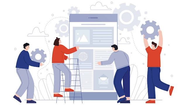

Crafting User Dashboards


  • Data visualization 

Depending on the industry, data visualization may differ in terms of users' expectations or the industry standards; hence a generic visualization may not always be possible. It can lead to problems if users are unaware of all the data visualization changes with the Saas UX Redesign.


A designer should be proactive with communication and the positioning of the message regarding the different changes that may affect users.


  • Navigational changes

In case of a redesign, a user, if not aware of the changes to the user interface, may face difficulty navigating through the application, thereby causing a decrease in productivity. If they cannot perform a task in a reasonable time frame, it may lead to engagement fatigue.


This can be minimized by limiting the number of changes per iteration, giving the user time to acclimate. Another critical aspect of a UX redesign should consider the user's behavior pattern through constant feedback. A user should be able to find the information they are looking for in the shortest period.


Interaction Design Foundation IDF  Free Membership Offer

  • Entry and exit points

A platform UX redesign can change entry and exit points and confuse users. They may miss important information when they exit the app and restart, and if they have to renavigate to the earlier point within the platform, it becomes challenging and tedious. 


When they get accustomed to an application, most people tend to create mental maps and know where to look for particular information within the app. Instead of renavigating the entire path, they tend to go directly to the destination; hence that becomes their new entry point. The UX redesign should maintain backward compatibility with the product's previous iterations to preserve users' navigation behaviors. They should have the ability to set their entry and exit points.


  • Cross-platform compatibility

UX design changes will vary depending on form factor - whether accessed from a desktop or a mobile device, drastically affecting the user's experience. There might be changes in the presentation of information with different platforms, and users may have to search for information several times, leaving a dent in their overall satisfaction with the product.


While redesigning a SaaS app, designers might face numerous issues. The best approach to dealing with these issues is simplifying the design process. Once all stakeholders understand each other's expectations, they can make better decisions that define the best UX for the enterprise-grade Saas solutions.


About author

Divami logo
Divami Design Labs
We are a devoted User Experience (UX) and Design Services Company focused on Digital Transformation, SaaS platforms, Mobile Apps & Enterprise Products. Over the last 10 years, we have delivered hundreds of projects for US and Indian companies across various sectors - Financial & Banking, Hospitality, Logistics, Healthcare, Social Media, and Enterprise Software. UX UI DESIGN Company
LinkedIn       Website 


Share:
Continue Reading →

Monday, 19 January 2015

What is Infographics? (Part 1)

This generation of modern world is called Information generation. Each day Internet network is getting heavier with information like text, images, videos, blogs, websites etc. We (people) are consuming lots of information in our day to day life. Only the information creation is not sufficient, we have to think about how to show information in effective and proper way so that a person is able to consume it in less time and in effective and engaging way. These aims can be achieved with the help of Infographics.
Infographics and data visualizations are all around us. We are surrounded by visuals representation of information- charts, maps, icons, progress bars, signs, posters, diagrams and online visuals. These are all example of visual communication, but all of these are not infographic.

What is Infographics now???

Presenting the information with the help of Graphics is called Infographics, so that it can be engaging, interesting and takes less time to understand.
  • Infographics are a fun and quick way to learn about a topic without a ton of heavy reading.
  • Infographics are a combination of both graphics and information. Infographics use the elements of design (like lines, text, boxes and symbols) to visually represent the content.
                          infog 1

  • It’s a way of talking numbers, spreadsheets and other kind of data and turn into one page of easily digestible and attractive graphics.
  • It can improve cognition by utilizing graphics to enhance the human visual system’s ability to see patterns and trends.

                            infog 2

                Example:  Showing finance related information in interesting way.

                      image


Why Infographics? And how is it effective?

There are a number of reasons why visual information is a more effective form of communication for humans. To understand the effectiveness of Infographics we should know more about brain first,


                                 image

Brain information processing

Our mind processes information in following generalize steps,
  • We sense things, data (sense through our sensors like sight, touch, hearing, smell, taste)
  • Our sensors send messages to our brain
  • Our mind process these messages and make information (Understanding)
  • Our mind stores this information in memory (Remembering)
  • Next time when we need, our mind provides information from memory. (Recognition and recall)


Some facts about BRAIN

                           image


In next article ‘Infographics Part 2’ we will be learning about ‘Picture Superiority Effect’, ‘Iconic Representation’ and ‘Contents of an Infographic’ in deep.

Some examples of great Infographics are given below, Enjoy…!!!


                            image
                    Source: http://www.smashingmagazine.com/2012/08/29/beyond-wireframing-real-life-ux-design-process/      


                            Source: http://www.hongkiat.com/blog/infographics-web-designers/


Chapter 2: Infographics Part 2: Iconic Representation >>


References:

https://venngage.com/blog/what-is-an-infographic/ 

http://www.business2community.com/online-marketing/5-cool-ways-use-infographic-templates-01123732

http://en.wikipedia.org/wiki/Infographic


http://www.creativebloq.com/infographic/tools-2131971


http://neomam.com/interactive/13reasons/


http://piktochart.com/how-to-pick-the-topic-for-your-infographic/


http://www.learningrx.com/cognitive-definition-faq.htm


Cool Infographics: Effective Communication with Data Visualization and Design


About Author

Abhishek jain
Design Lead UX Researcher


Share:
Continue Reading →