Imagine if you will, standing on the surface of the moon, overlooking a crater from your lunar rover, listening to mission control chatter. Or don’t. Instead of imagining it, just order a cheap Google Cardboard VR set instead, stick your phone in it, and start exploring the solar system, museums, tourist spots, coral reefs and much more. Let the Imagination Technologies GPU in your phone live up to its name and do your imagining for you.
Google Cardboard is hardly a new concept. It was unleashed on the unsuspecting geekosphere at Google I/O 2014, roughly 18 months ago. Since then, Google has tweaked the Cardboard reference design, but the concept hasn’t changed; Google Cardboard was envisioned as the cheapest Virtual Reality (VR) solution on the planet, and at this point, nothing else comes close in terms of pricing.
Google Cardboard is significantly cheaper than competing VR platforms, so why is adoption so slow?
If you keep track of tech news, you are probably aware that Oculus Rift started shipping a few days ago. The news even made it to mainstream media, and CNN interviewed a few Oculus execs, who discussed the future of Oculus and VR in general. Demand for the Rift appears to be high because the pre-order website crashed hours into the launch, which coincided with the Consumer Electronics Show (CES) in Vegas. The Oculus Rift is priced at $599, and you also need a $1,000-plus computer to use it properly, but the high price obviously didn’t faze the loads of consumers who pre-ordered one.

I could try to explain what makes Oculus different and why it costs so much, but that’s beside the point. It’s a product for enthusiasts and connoisseurs, people who don’t mind spending a lot of money for a great gaming user experience or for some niche professional applications. Compared to Google’s VR platform, Oculus Rift is a technological tour de force, but for the price of a single Oculus headset, you can get more than 50 prefabricated Google Cardboard headsets. Mind you, I am not talking about cardboard DIY sets, but proper headsets made out of plastic, with soft padding and a few straps to keep the contraption on your head.
Considering that you can get a Google Cardboard compatible set for $10 to $20, you’d expect that loads of people are buying them, but that’s not the case. Let’s take a closer look at Google’s platform and try to figure out what’s going on.
2016: The Year Of VR? Not Really
71,000.
In addition to being the ZIP code for Sarajevo, that’s the number of users that have rated the official Google Cardboard app so far. The number of downloads is in the one to five million range. That’s low by anyone’s standards, and for a Google product 18 months after launch, it’s a shockingly poor result. Granted, there are VR apps with more downloads, but even they are stuck in the 100,000 to 500,000 range.
Does this mean we should dismiss Cardboard as a hyped up geek fad? Does the user experience suck? What the hell is wrong with it?
This may sound a bit harsh and opinionated, but I believe Google simply can’t do hardware. Regardless of how good they are, Google sucks at marketing its own hardware solutions. In the interest of full disclosure, I am a Nexus veteran and I tend to like Google hardware, but most consumers don’t (many don’t even know it exists). The fact that people aren’t buying a dirt cheap product like Cardboard, and that more companies aren’t using it to build their own products and services, despite the fact that it’s free, might vindicate my position on Google hardware.
There is just one problem: Google Cardboard is a good idea and it works.
While Google may not excel at hardware, Cardboard VR is a sound concept and it works.
Rather than dismiss Cardboard outright, I decided to try it out. I quickly realised the concept is sound and there’s nothing terribly wrong with the user experience, but once again, Google failed to market it properly and make it appeal to non-geeks. As a result, adoption is pathetic, at least for now.
What about VR adoption and popularity in general? Weren’t we told that 2015 was going to be “The Year of VR?” Or was it supposed to be 2016? I am sure CNN said it was going to be this year.

It all depends on whose marketing pitches you were listening to, but in reality, 2016 will not go down in tech history as the year of VR. Sure, it sounds good and investors like the idea, but it’s not going to happen. This is not my personal opinion. A few industry sources believe things will start moving in 2017, but it will take a while.
When I say “industry sources,” I am talking about GPU industry execs, people who know this stuff better than anyone. They’re pointing to 2017 and beyond, but they’re doing so off the record. This applies to cheap VR solutions like Google Cardboard and expensive sets like Oculus Rift: VR won’t get a lot of traction this year, don’t fall for the hype!
Google Cardboard: VR For The Masses
How does Google Cardboard work? What makes it different?
The really fascinating thing about Google Cardboard is its simplicity and low price. The concept relies on off-the-shelf hardware, you just need to stick a smartphone into a Cardboard headset and you’re ready to go, more or less.
As the low price suggests, Google Cardboard doesn’t contain any magic or expensive components. All you need is a couple of lenses, a plastic or cardboard body, and a couple of magnets which double as a physical button. When you push the button, the phone’s magnetic sensor, or e-compass, detects the changes in the magnetic field and that’s all there is to it.
The recipe for Google’s Cardboard VR special sauce: simple, widely available, cheap, open-source, based on prolific hardware.
There are a few caveats: Google Cardboard won’t work on any phone because it relies on sensor input that might not be available on many devices (gyroscopic sensors aren’t very common on cheap phones). The phone also needs to have a high resolution display, but thanks to the pixel density marketing craze, this shouldn’t be much of a problem moving forward. Having a bigger display with more pixels simply makes everything look better. While 1080p on a 5-inch phone sounds like a lot, once you start using Cardboard, you’ll see individual pixels. I didn’t try it on a 720p display, but I am convinced it wouldn’t be enough. There are a few other problems, such as battery consumption and overheating, and let’s not forget that you could get a call or message while you’re in the middle of your VR experience.
In spite of these foibles, Google Cardboard has a lot going for it. For starters, it does not require consumers to spend a small fortune just to get a taste of VR. It relies on one of the most prolific software/hardware platforms on the market, so it’s within easy reach for hundreds of millions of smartphone users and developers alike.
Unfortunately, this vast potential has not translated into market success. With a few dozen thousand users in the wild, I could hardly blame anyone for dismissing Cardboard as a geeky curiosity, but I’d stop short of calling it a flop.
What Went Wrong?
Nothing, apart from the fact that Google can’t do hardware.
To be fair, Google Cardboard wasn’t envisioned as a product with mass market appeal and I personally view it as a tech testbed rather than a proper product. It’s not the only VR concept to rely on a phone for display and processing: Samsung’s Gear VR is similar.
However, this seems to be part of the problem, because it does not appear Google is taking Cardboard very seriously. Although Google Cardboard was released 18 months ago, a lot of building blocks weren’t ready for launch. Google is still dragging its feet, but there’s some progress: As of May 2015, Cardboard can be used on iOS devices, it has better OpenGL and WebGL support, and Google launched a few new VR initiatives, including Jump and Expeditions. YouTube also got a dedicated VR/360 degree video channel, and it could become the go to place for people searching for VR video.
Cardboard’s biggest problem is not technological.
The platform is too small to attract a lot of third-party development, and who could blame app makers for refusing to waste man-hours on projects that don’t guarantee a return. That’s one of the reasons I decided to try it out; I kept looking at Google Play stats, the terrible reviews and I started wondering whether or not Google Cardboard has a bright future, or any future for that matter.
I don’t intend to turn this post into a Google Cardboard review, but I think it’s important to review a few things, just to give you a clear idea of what to expect (in case you haven’t tried it, yet).
Let’s start with Cardboard requirements. I should note that these are not official Google Cardboard requirements:
● Android 4.1 or iOS 8 device required
● Gyro sensor
● NFC or magnetic sensor
● High definition display (1080p is sufficient, the more the better)
● High capacity battery can’t hurt
● Loads of storage
● Fast network/broadband access
The good news is that there aren’t any software hoops to jump through. Since Google Cardboard relies on standard smartphones, designers and developers are unlikely to encounter many hardware-related issues. The biggest hardware compatibility issue is on the sensor side. A lot of inexpensive Android phones don’t feature some of the sensors that may be employed by Cardboard apps (namely gyro and magnetic sensors).
Google Cardboard can accommodate a range of different phone sizes, so it should work on standard 5-inch phones, as well as oversized 5.5- or 6-inch phablets. Display density isn’t much of a problem on 1080p, although it could be better. Resolution will eventually go up, as hardware-makers shift to 1600p and 4K/UHD displays on plus-size phones. Sony already has a flagship Android phone with a 4K display.
I’ve already discussed the more or less pointless trend of moving to higher definition phone displays in one of my Toptal blog posts, but VR is an exception. There’s no way you’ll see individual pixels on modern, high-definition phone displays, unless you use them in a Cardboard headset.
However, higher resolution displays don’t mean a thing unless you’ve got high-res content for them. Unfortunately, there’s not a lot of 1080p VR content out there, let alone 4K/UHD content.
VR Video Resolution Conundrum
Bear in mind that increasing the resolution comes with trade-offs. This brings us to the next problem: Even if we had loads of 4K VR videos, how would we get them on our devices? The problem I encountered was simple: I quickly started running out of bandwidth and storage, in some cases even on 1080p. Sure, you can stream 1080p video on even a slow internet connection, but you’ll often need to slow down and give your device time to buffer, which is always annoying, but it’s really annoying when you have a VR headset strapped to your cranium.
Some of you may be thinking that I live in a part of the world with terrible Internet infrastructure, and I’ll be the first to admit that Bosnia isn’t exactly Silicon Valley, but bear with me; my broadband is still faster than the average speed in the US, UK, Sweden, Japan, and a bunch of other highly developed economies. In other words, a lot of users in California and Tokyo still rely on even slower Internet access. Recent surveys indicate that just one fifth of US homes have enough bandwidth to stream 4K content.
I know. I’ll just download the videos and enjoy them off local storage, but it’s not an ideal solution. First of all, a lot of content isn’t available for download at all, it’s just streamed. Worse, you’ll need a lot of storage to pull it off. For the past couple of years, mobile services have been shifting to streaming in lieu of local content, allowing people to make good use of fast mobile broadband. Why keep gigabytes of music and video on your phone when you can enjoy Netflix or Spotify on the go? Resorting to local storage for high definition VR feels like a step back, but if you’ve got good 4G coverage or fast broadband in your home, it won’t be much of a problem.
Limited bandwidth and resolution are the biggest problems facing virtual reality video at the moment.
In addition to requiring more bandwidth, high resolution content also requires more processing power. At 1080p, this isn’t a problem because this industry-standard resolution has been around for ages and even cheap hardware handles it with ease. However, at 4K you simply need more bandwidth and CPU/GPU muscle to handle the data and decode the stream. This means more milliamps, more heat, more charging. Smartphones aren’t designed with this application in mind, they’re simply not supposed to be used for this stuff. With cranked-up screen brightness, high CPU and GPU loads, and a lot of data streaming in to ensure smooth playback, a standard phone will run out of steam in a couple of hours or less. On top of that, it will heat up in minutes. Bear in mind that there’s no airflow inside the headset, so the device will have a hard time dissipating the heat.
I tried it out on a Snapdragon 808 device. For those who don’t pay close attention to the silicon space, this is a one of the latest Qualcomm smartphone chips. It’s a 20nm planar part with a couple of ARM Cortex-A57 CPU cores and powerful Qualcomm Adreno 418 graphics. The same chip is used in Google’s new Nexus 5X. It’s fast enough, but it heats up in no time despite the fact that it’s one of few mobile chips to be produced in a node superior to 28nm.
However, video is not the only type of VR content out there. Let’s take a look at some alternatives.

Different Types Of Google Cardboard Content
I focused on video in the first section of the article because I feel it will be the most attractive form of VR content, at least at this early stage. However, I think people who choose to use their VR headsets solely for video will be missing out.
VR video is usually limited in terms of terms of field of view, and what you see is what you get: You can’t walk around a VR video scene, you’re just stuck in a single virtual location, either a front row seat at a Paul McCartney gig, or a cockpit of a Swiss Air Force F-5 jet performing an acrobatic routine. My problem with video and photos is that the user can truly enjoy this sort of content only once, and there’s not a whole lot of it out there.
Don’t get me wrong, these experiences can be good, but what about getting my glorious behind off the sofa and navigating a real VR world? What about generating a different environment every single time, and interacting with it?
The only way of doing this is on Google Cardboard by rendering the content locally and putting the user smack in the middle of a digital environment. We’ve been doing this since the early nineties, when games like Wolfenstein took the world by storm (and games like Descent made a lot of geeks experience motion sickness without moving, just by staring at their screen).
It’s possible to render 3D VR content locally on most smartphones, but quality is limited due to a range of technical challenges.
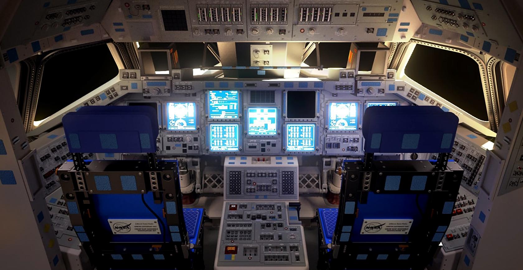
This is what makes Oculus Rift fundamentally different: It relies on desktop hardware to render 3D content and display it on the VR headset. This is obviously a huge difference, and the official Oculus Rift requirements look like a gamer’s shopping wishlist: a powerful Haswell generation Core i5 processor backed by 8GB of RAM. More importantly, the list includes Nvidia GeForce GTX 970 and AMD Radeon R9 290 discrete graphics cards, based on Maxwell and Hawaii GPU architectures respectively. High-end PC processors, like the one listed by Oculus, usually have about 1.5 billion transistors. Big GPUs, like Maxwell and Hawaii designs used in the GTX 970 and R9 290, have five to seven billion, and they’re getting bigger. The combined power draw of a PC with such specs is a few hundred Watts, roughly 100 times more than the power consumption of an average smartphone chip. In other words, even if you still believe in Moore’s Law, it’s obvious that we won’t get the same level of performance on mobile devices for years.
Most smartphones have enough GPU muscle to render good looking 3D scenes in 1080p, although they don’t come close to the sort of overkill graphics you get on a high-end PC. You can forget about fancy shaders, advanced antialiasing techniques and many post processing features, but let’s not forget that phones have come a long way and that this sort of technology would have been next to impossible just five years ago.
This is not the only bit of good news; Google has two SDKs for Cardboard developers: an Android SDK using Java and a Unity SDK, using C#. Both rely on OpenGL, and Unity support was added to the iOS SDK earlier this year. Once you are no longer bound to video, VR starts to make a lot more sense. Done right, artificial environment can immerse users into a dynamic and interactive 3D environment, so even simple demos look and feel good.
Even if you plan to rely on video content or photos, you’ll still need a UI that works, and chances are it will use some form of 3D, or at least 2D objects placed in a 3D environment, per Google Cardboard guidelines. Most apps that focus on digitally generated imagery instead rely on Unity. There’s nothing wrong with that, Unity is a popular engine and it’s quite capable.
As I’ve already pointed out, Google Cardboard relies on standard hardware, hence there aren’t that many technical challenges to overcome. Make sure you follow Google’s Cardboard guidelines and best practices, and you should be in the clear.
3D Is The Way To Go, Sort Of
So what’s the problem with using Unity and 3D graphics in general? It sounds straightforward and offers people a chance to experience a true VR experience on a budget.
Let’s not get ahead of ourselves. Here are a few issues that come to mind:
● Battery life
● Heat dissipation
● Limited GPU power
● Need for high resolution assets (mainly textures for 3D models)
● Different level of detail (LOD) approach
● Motion sickness
● Limited ability to control movement and interact with environment
I’ve already addressed the problem of heat and power consumption. Placing a smartphone in a small environment with no airflow and maxing out the GPU is more or less the worst thing you can do in terms of thermals and efficiency. This issue cannot and will not be resolved. Phones simply aren’t designed to be used this way.
This brings us to the next problem: GPU performance. While smartphone application processors have evolved at a staggering pace, they are not developed for sustained performance. A discrete graphics card or integrated GPU on your desktop can run at high loads for hours, even days, but your mobile GPU cannot. Once the device starts overheating, it will throttle the processor to stay within the thermal envelope, protecting the hardware and saving battery power. Sure, you can get good graphics out of smartphone chips, but running a VR app with a virtual UI in 3D, along with loads of core 3D content, will drain the battery and overheat any phone.
Mobile game developers already know a thing or two about optimising their creations for this sort of hardware. Unity has been around for years, so generating good looking 3D content should not be a problem, right? It depends on the type of environment being designed. If it’s supposed to be a photorealistic 3D environment with advanced lighting and post processing, designing for VR could prove a bit more challenging. This is the problem: Although we’re still using the same resolution, the field of view is much bigger. As a result, the VR experience on a 5-inch 1080p display looks a bit pixelated, and you certainly get to see a lot more details than you usually would. While these devices boast high pixel density displays, the real metric to have in mind is PPD rather than PPI.
This basically means the user gets to see more than you’d expect given the resolution, which means 3D models and textures need to be optimised for a wider field of view. For example, a few low resolution textures won’t ruin the appearance of 3D model on a 5-inch phone. It can still look good because of the small size of the display, but once you put the same phone in a VR headset, you’ll get to see all sorts of compression artefacts and other nasty stuff. If an object looks good on a phone with even with a low LOD, that doesn’t necessarily mean it will look good in VR; it might need more complex geometry and textures. It’s not solely the resolution, please keep that in mind.
Lastly, motion sickness and nausea remain a concern. One of main causes is lag. It takes a tiny amount of time for the phone’s gyro sensor to figure out the user is moving, and then it takes a bit more time for the phone to crunch the numbers and render the subsequent frame while taking the motion into account. If, for any reason, something goes wrong and you drop a few frames or experience stuttering, the VR illusion will break down right before your eyes. This process should be fast and automated to such an extent that the user has no idea what’s going on behind the scenes.
However, this is easier said than done in complex, heavily subdivided 3D scenes with huge textures. A standard phone will struggle with photorealistic graphics even when it’s not overheating, so trying to get a phone to render smooth, photorealistic 3D graphics is not a viable option at this time. In addition, a number of effects and features that could help improve the visual experience are not available. Sure, motion blur, depth of field effects, high-quality antialiasing and other techniques would help, but they’re still not an option on mobile devices.
Google Cardboard For Developers: Opportunity Or Waste Of Time?
So, Google Cardboard is not perfect, it suffers from a few teething problems, lack of content, lack of users, and lack of developer interest. By now, a lot of you must be wondering why I am convinced Google Cardboard has potential. After all, I listed a number of real and potential problems hampering mass adoption.
Why bother with Google Cardboard?
It’s a legitimate question, and considering the size of the user base, coming up with a good answer is not simple. This is still a very tight niche, and even if you manage to come up with a great idea and execute it flawlessly, you won’t make much of a difference (or much money, for that matter). The limited number of people interested in VR is a huge problem.
This lack of interest becomes obvious as soon as you start browsing the Play Store for VR content. There aren’t that many Google Cardboard apps around, and I can confidently report that most of them suck. If you don’t believe me, just check out the user reviews. In fact, many of these apps aren’t real apps; they’re tech demos.
Did Android developers drop the ball? Not really. A lot of these subpar apps are clearly a work in progress, or they are pet projects that allowed individual developers to play around with VR. Very few apps come from big publishers and this is understandable; with such a small user base, nobody can afford to burn thousands of man-hours to create an app that won’t turn a profit. Oddly enough, this could be good news. If you are confident you can do a better job, go for it. There’s not a lot of competition, and if you create something good, your product will definitely stand out.
Not all Google Cardboard apps are bad, so you could try out a few quality designs to get a sense of what makes them tick. I usually don’t list products and services in my blog posts, but I will go ahead with a few examples of promising Google Cardboard apps:
● Jaunt VR is a highly acclaimed VR platform with one of the best user review scores of any VR app on the Play Store. Jaunt is a relatively big player in the small VR ecosystem and has a number of good products. I’d direct your attention to the UI layout and the quality of the content itself.
● YouTube and Google Maps are an obvious choice, and happen to be the only Google core apps with Cardboard functionality. They will give you a chance to check out how Google does stuff, although I was not too impressed. Don’t underestimate the power of YouTube. If a lot of VR content is uploaded, it could tip the scales in Google’s favour.
● Fulldive is an ambitious app with loads of features. You can use it to view panoramic photos, watch local and YouTube videos, take VR photos and more. There are a number of similar apps out there, but I feel the Fulldive team did a better job in the UI department. The UI is clean, fast and intuitive.
● Sites in VR is a different sort of app and I think it’s a good showcase of what might be achieved by an individual developer. The app allows users to experience a number of different VR sites, ranging from the lunar surface to the Eiffel Tower, plus some good-looking examples of Islamic architecture. I appreciated the ability to tweak settings that aren’t available in most VR apps.
● VR Roller Coaster is a good example of 3D VR, and the name is self-explanatory; roller coasters are a popular theme in VR apps. In addition, the same concept is used to create a VR tour of the Solar System.Titans Of Space and VR Cosmic Roller Coaster are good examples of this approach.
● Shadowgun VR and Sisters are nice examples of VR games; the latter is spooky, if you’re into that sort of thing.
We intend to publish more content dealing with the finer points of VR design and development, so if you are interested in this emerging field, be sure to tune in from time to time.
The Elephant In The Living Room
It’s bad for SEO, talking about it is bad for tech publications in general, and it might not go down well with some of our team members or redears, but I have to get it out of the way. So what is it?
The adult entertainment industry played a pivotal role in the adoption of legacy video standards. Can it boost VR adoption as well?
There, I said it. And no, I wasn’t joking.
The adult entertainment industry was instrumental in the adoption of multiple video standards, from VHS over Beta, to Blu-Ray over HD DVD. Granted, these were physical storage standards, but they were around when physical storage mattered a lot more than today. Nowadays, content distribution is digital, on-demand and fast. Best of all, the same content can be distributed across multiple platforms with relative ease.
The adult industry played a pivotal role in the mass adoption of major content standards for decades. It can do it again, albeit not through physical standards. It can obviously make a big difference by generating demand for all sorts of VR devices. Google Cardboard looks like an obvious candidate for VR content distribution on the cheap, and it will undoubtedly be the first glimpse of VR for millions of users.
Does anyone doubt the adult entertainment industry will attract millions upon millions more? For many people, that first glimpse of VR could be described as NSFW.
Virtual World Of Potential
Google Cardboard is a good step toward mass adoption of VR. It’s not without its problems, but we can’t expect miracles this early on, especially not from the cheapest VR platform on the market.
But that’s sort of the beauty of it: It’s cheap and disposable, yet it’s upgradeable. You can get a better headset if you feel like you need one, and the occasional phone upgrade should take care of the actual hardware behind it. One could potentially repurpose old phones as well, provided they sport the necessary sensors and hardware.
Despite my optimism, Google Cardboard isn’t a very popular platform and I don’t think anyone expects it to become one in the immediate future. However, in the long run, I am confident it will attract a lot more users, and not just geeks. As always, mainstream users are the Holy Grail, and I can report that non-geeks are even more impressed by the Google Cardboard experience than tech savvy people.
It all boils down to content. There’s not enough VR content out there, use-cases are limited, and there’s not a lot of urgency to get involved. However, moving forward we are bound to see a lot more VR video, along with other types of content. As soon as we see more VR content being churned out, we will see more adoption. I suspect many people will choose to try out VR over the next couple of years, and once VR starts gaining mainstream traction, price will become even more relevant.
In a mass adoption context, the fact that people can enjoy Cardboard VR for the price of a decent lunch could make Google’s “no frills” VR concept a lot more attractive in no time.
About Author
Nermin Hajdarbegovic
This article was originally published on
Toptal


%20in%20India.png)